
Taste of Oregon App
Connecting Oregon local producers with grocery shoppers.
Timeline: July - December 2020
Problem:
There are hundreds of local producers in Oregon who grow, harvest, or cultivate seasonal goods to sell, but it’s hard for shoppers to know when and where to purchase these items.
Solution:
An app which allows people to search for local food and plant options in their area. This helps people of all income levels
feel more confident about their purchasing options
support neighbors
and understand where their foods and plants come from.
It also helps local businesses better communicate with customers and educate them on the growing process.
Overview: I grew up on a peach orchard in Oregon. I ate locally-grown foods and found Christmas trees at neighborhood farms. When I moved out for college and my first job, it was more convenient to buy all my food at the grocery store. But every summer I helped my parents with the orchard’s social media page and shared the benefits of locally produced foods. How can I eat local foods without living on the farm? What is the real obstacle to a lifestyle I saw so many benefits in?
My role: research, sketches, wireframes, design system, high fidelity, prototypes, usability testing
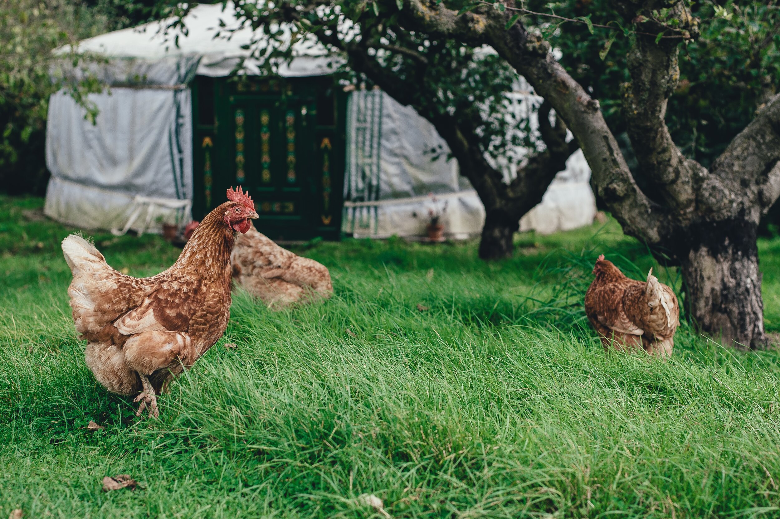
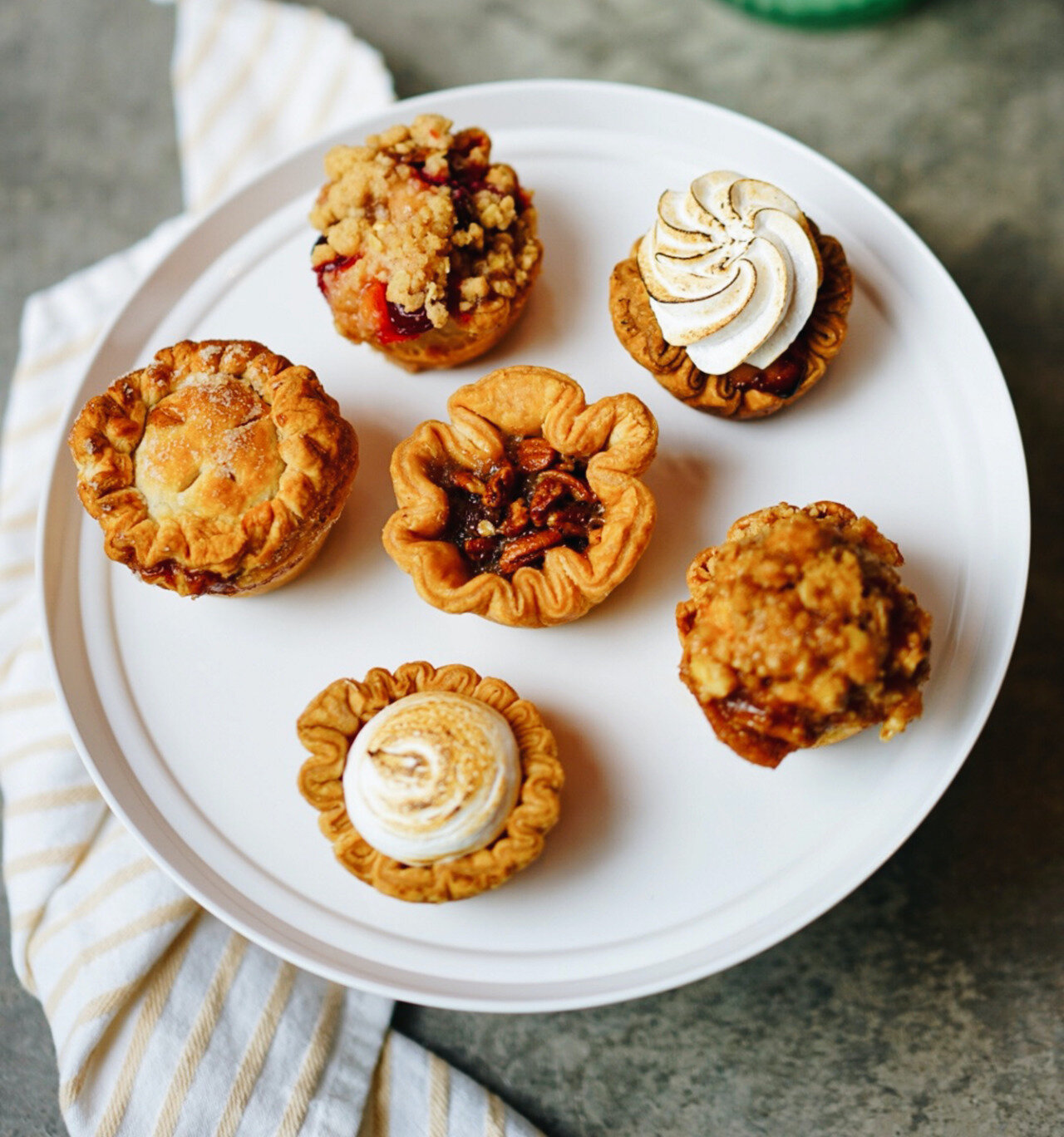
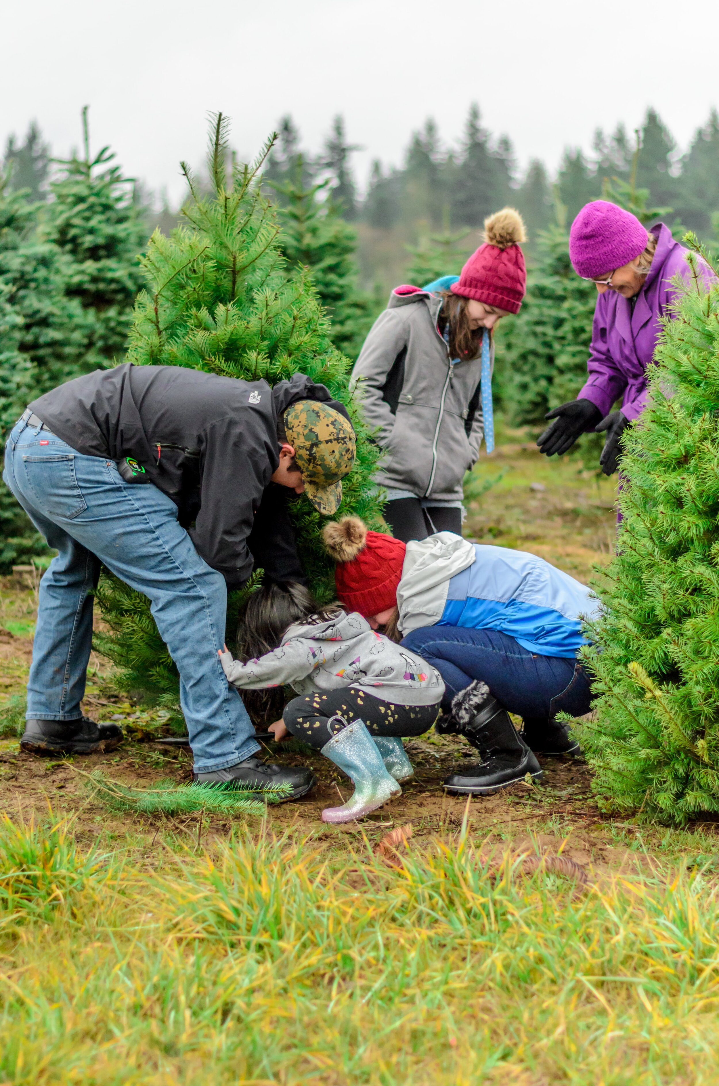
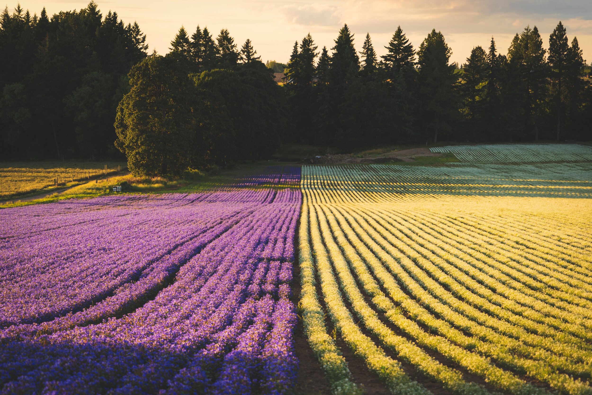
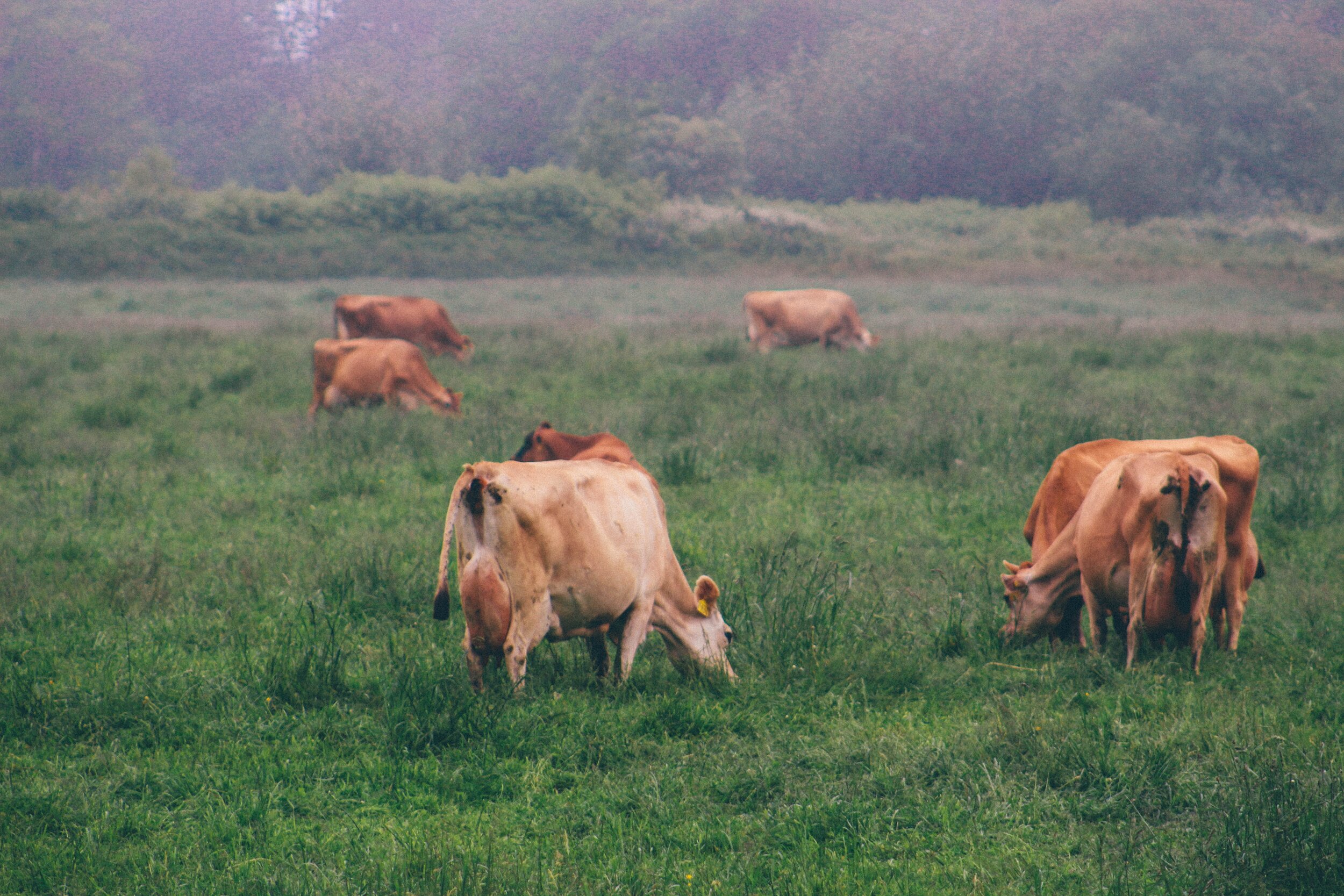
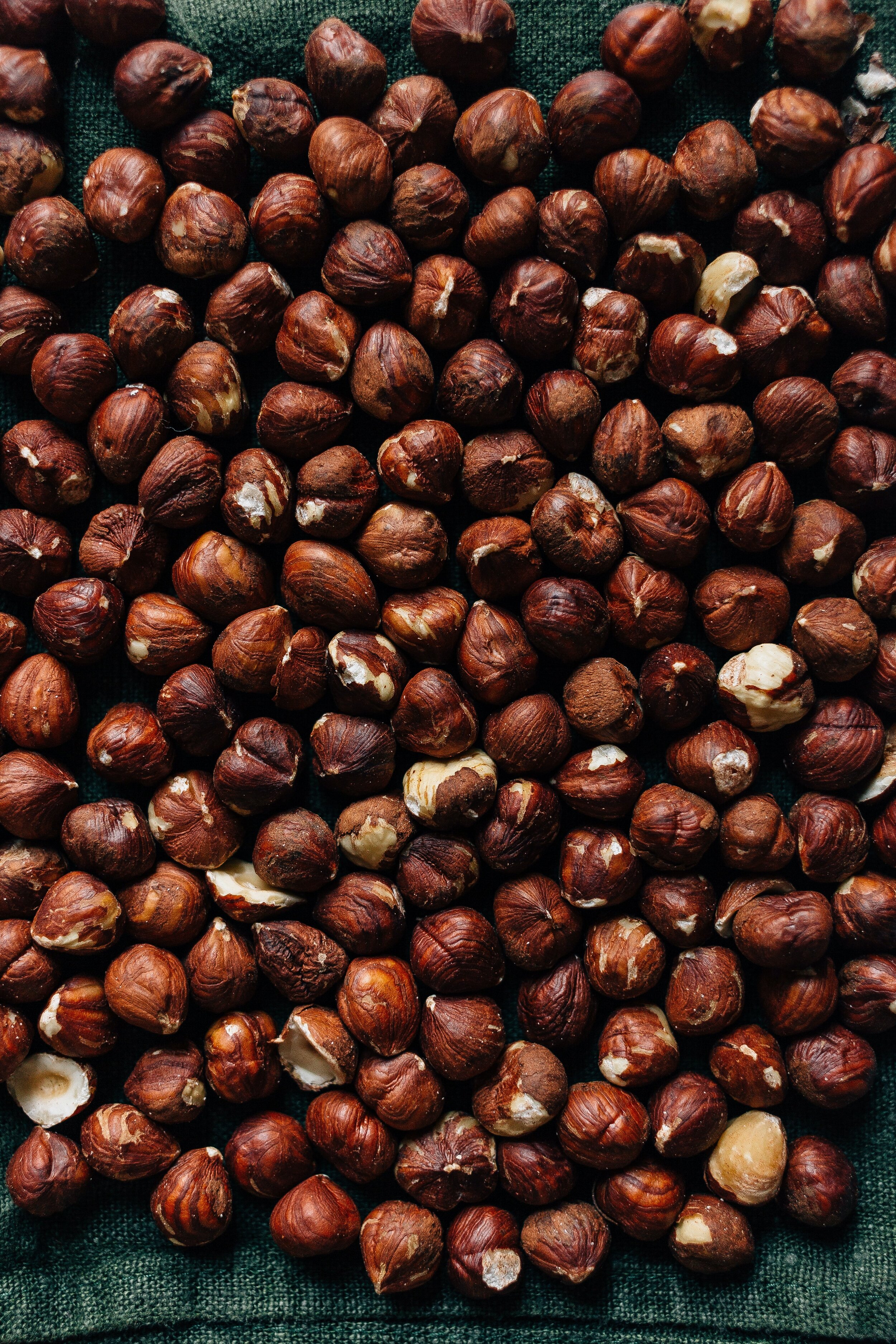
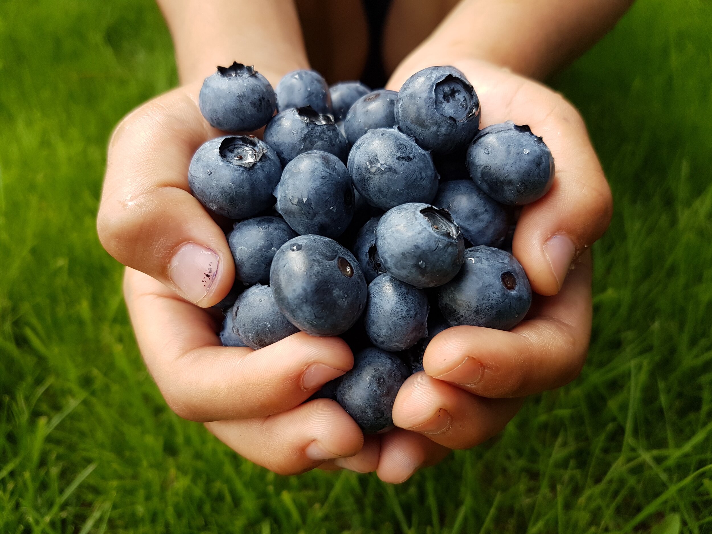
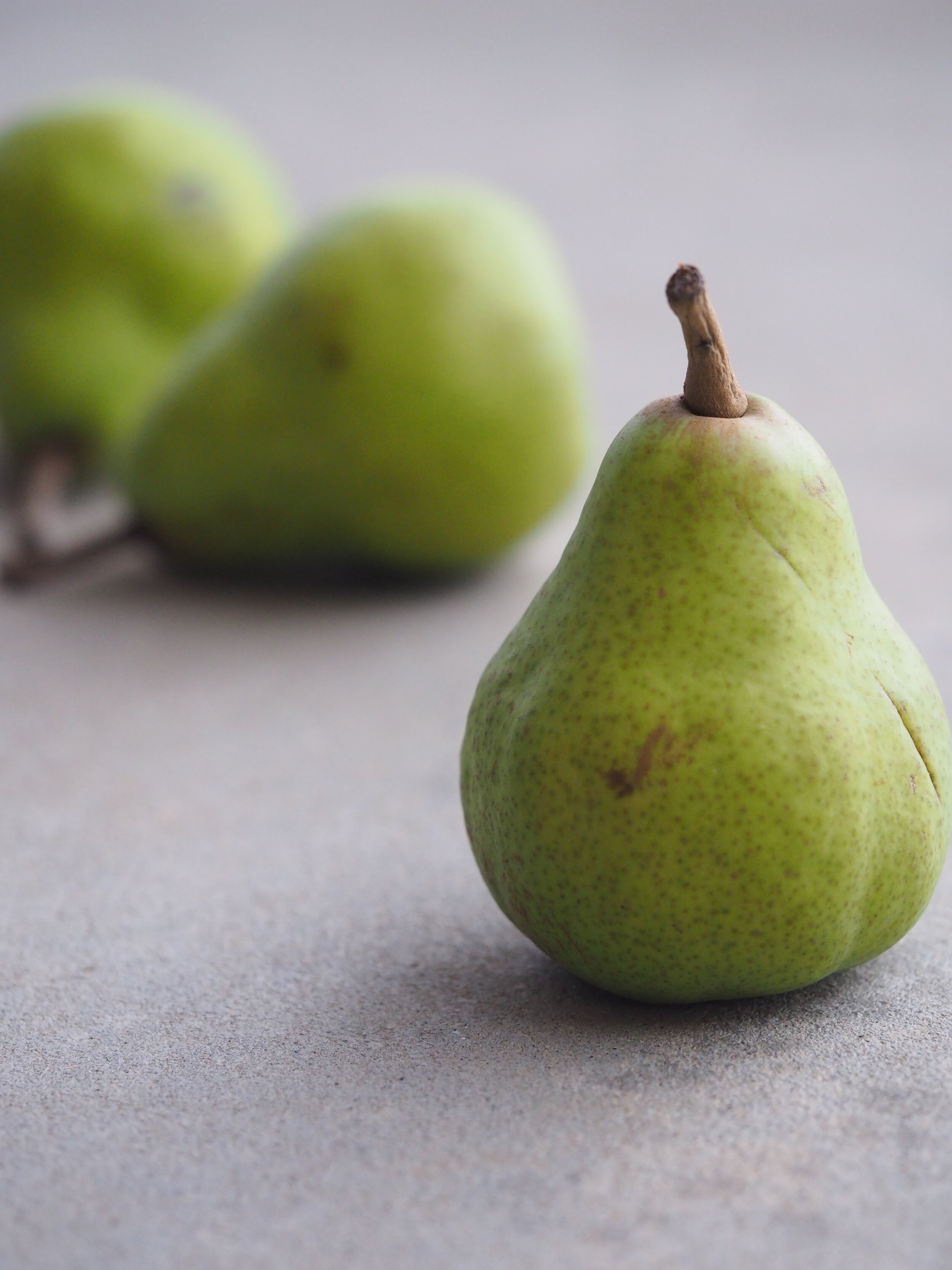
Local produce: Christmas trees, honey, local meat and dairy, baked goods, preserves, plants, seafood, nuts, and more. Since grocery shopping is a regular rhythm for people, I focused more on food options in my research and interviews.


Research
Purchasing local items is a popular idea...so why do we keep going to the grocery store?
I started my research with a web search to see how easy it is to find information about producers.
There’s no single website with all the producers in Oregon.
Searches have to be specific to an area or product, and then sort through all the options.
There’s no app for this, and many producer websites are not mobile-friendly.
Survey
I sent out a survey and received 37 responses to find common pain points
How likely are they to purchase from local producers compared to grocery stores?
Biggest hurdles in purchasing from local producers
Do they use a desktop or mobile device more often?
Of the people who took my survey,
I also conducted 5, 30-minute interviews
My sample set did not represent all Oregonians equally. In my interviews I was able to reach out to three OSU Extension Office workers to learn more about their work with lower-income families in Portland and Eastern Oregon.
These showed the strongest pain points were
Not knowing where or when to purchase food
A lack of time to shop
Business hours not working
Too expensive
Affinity Map
I used an affinity map to catalogue all the responses. Key sections include
When you get it
Where you get it
Who you get it from
How you use it
Cost
I condensed the information into Empathy maps and Personas


I distilled these pain points and problems into three How Might We questions:
How might we decrease the amount of time it takes for people to find information about Oregon local producers?
How might we introduce people to local producers in a way that is informative and relatable?
How might we help people find information about local products that communicates value and availability?
Sketching
It was time to go to the drawing board! I settled on an app to gather all the information in one place.

Timeout - there’s another set of users
During my research, I realized there is another user group I did not address: the business owners. How can they communicate well to shoppers?
I interviewed three local producers. This is obviously only the beginning of research needed, but their top pain points are:
Time - Growing or harvesting products takes a lot of time and energy. Add the rest of life and communicating with customers is hard.
Advertising - There are dozens of ways to communicate with customers: website, social media sites, city or local area groups, TV programs, events and shows, etc. Some are more effective than others, but altogether it’s overwhelming.
Seasonality - Unlike grocery stores, local producers have a seasonal rhythm for their products, shorter shelf life, limited quantity, and imperfect options.
What I still need to know:
How many farms and local producers already provide info online?
How often do they update that information?
How can this app make communication easy for local producers as well as consumers?Make it stand out.
Information Architecture
How can my app solve user needs?
User stories:
From the personas, I knew what specific problems I needed to address. So I went back to the sticky notes and reorganized steps into user stories like this one. I picked the essential options out to include in my Minimum Viable Product (MVP).
Sitemap
Like a family tree, this can easily branch out farther than it’s easy to map onto one page. This showed me how much content I was dealing with. I needed to factor in hundreds of products in easy-to-search ways. This is important to help Katie, the Hipster Scientist, find the unusual items for experiments, and to help Asanda, the Budget Supermom, find options she’s familiar with.
Userflows
By mapping out actions for a user, I saw how a basic search feature with good filters would meet the needs of my different personas. Asanda can look for bus routes while Katie filters for delivery. The profile section allows users to save favorites and get alerts.

Heuristic Analysis - I analyzed three competitor sites including Yelp, Milkrun (a Portland local producer delivery service), and a Seasonal Food Guide app. Each uses clear images and standardized tiles to display information. This reduces cognitive load and keeps the process streamlined.
Paper prototypes
I used the Marvel app to create a paper prototype. After a test run and modifications, I conducted five tests. My key feedback included:
Profile confusion - let people know alerts are available, but signing up is optional.
Replace recipes with guides to help choose items. This is perfect for unfamiliar products, and all the personas would benefit.
Wireframes and wireflows
With Google’s Material Design as a guide, I created wireframes in Figma for my Minimum Viable Product (MVP). I focused on red routes to enable users to complete the following three tasks: search by product, search by area, and sign up or log in.
Edgecases - I tested my designs with long names in text areas and played with image sizes.
Visual heirarchy - Advice to not go below 16 pt in my designs gave me a challenge. How did I include a lot of information and keep good white space?
Hamburger menu - I realized I needed a place for Help, FAQ, and user settings. Feedback is key for this app - reporting incorrect information, if a place went out of business, inappropriate reviews, or suggesting a new business.
Spread the word - As a business, this app needs people to tell others about it. A share button and reviews are standard features. Perfect for social media users like Katie. A Plan a Trip feature is another option - Debbie can plan trips while Asanda plans rides.
Design system
I started with a moodboard then created a brand statement, name, and logo.


Color accessibility: Many users will be on the road, so clear contrast is important. Green is my main color. I originally contrasted it with orange, but realized they look the same to some people. Changing orange to slate purple gave more contrast, and the purple acted as a warm neutral.
Icons - I used the open source coolicons by Kryston Schwarze. I adapted or designed several of my own to meet business needs.
High Fidelity V1
I adapted my wireframes to high fidelity mockups and learned how to do some animation for drop-down menus in Figma.
Usability Testing
I created my first prototype in InVision and conducted five, 30-minute usability tests. I struggled to write good tasks for people and provide enough flexibility in the prototype. Make it stand out.


High fidelity final prototype
User Testing Part 2 and results
I created a new prototype in Figma and conducted another five, 30-minute tests.
Test results:
My assumptions limited user flow. I overlooked some functions. So I created a page to search for producers from the nav bar and also a producer updates page.
People rely on Facebook or websites for up-to-date info. I added a page to see producer newsletters. It’s a good spot for businesses to pay for advertising.
Profile doesn’t fit all users. Inform people what they can do through the profile and allow it to be an optional feature.
People want more ways to share info about producers. I added a share feature for easy access.
Lists are good to stay organized. I added a list feature to add items as people navigate the app. This can be accessed without a profile. It didn’t prototype well, but would be perfect to compare items for budget-consious users like Asanda and Debbie.
Future steps
create a way for favorite businesses to show up on the homepage.
Add favorite trips to the “Plan A Trip” page
App viability
This app would be useful to many Oregonians, but it has no built-in cash flow. It may pair well with another business or be a good nonprofit service to offer people.