
Tiny Tales Design Sprint
This is a tablet app designed with Figma for iOS during an individual design sprint.
5 Day Design Sprint
January 20201
My role
As a team of one, I was given the research background for this project and then conducted ideation, sketches, prototyping, and usability testing.
Design Constraints
The app has a collection of books from authors - parents do not purchase books, but read in the app.
Deliverable
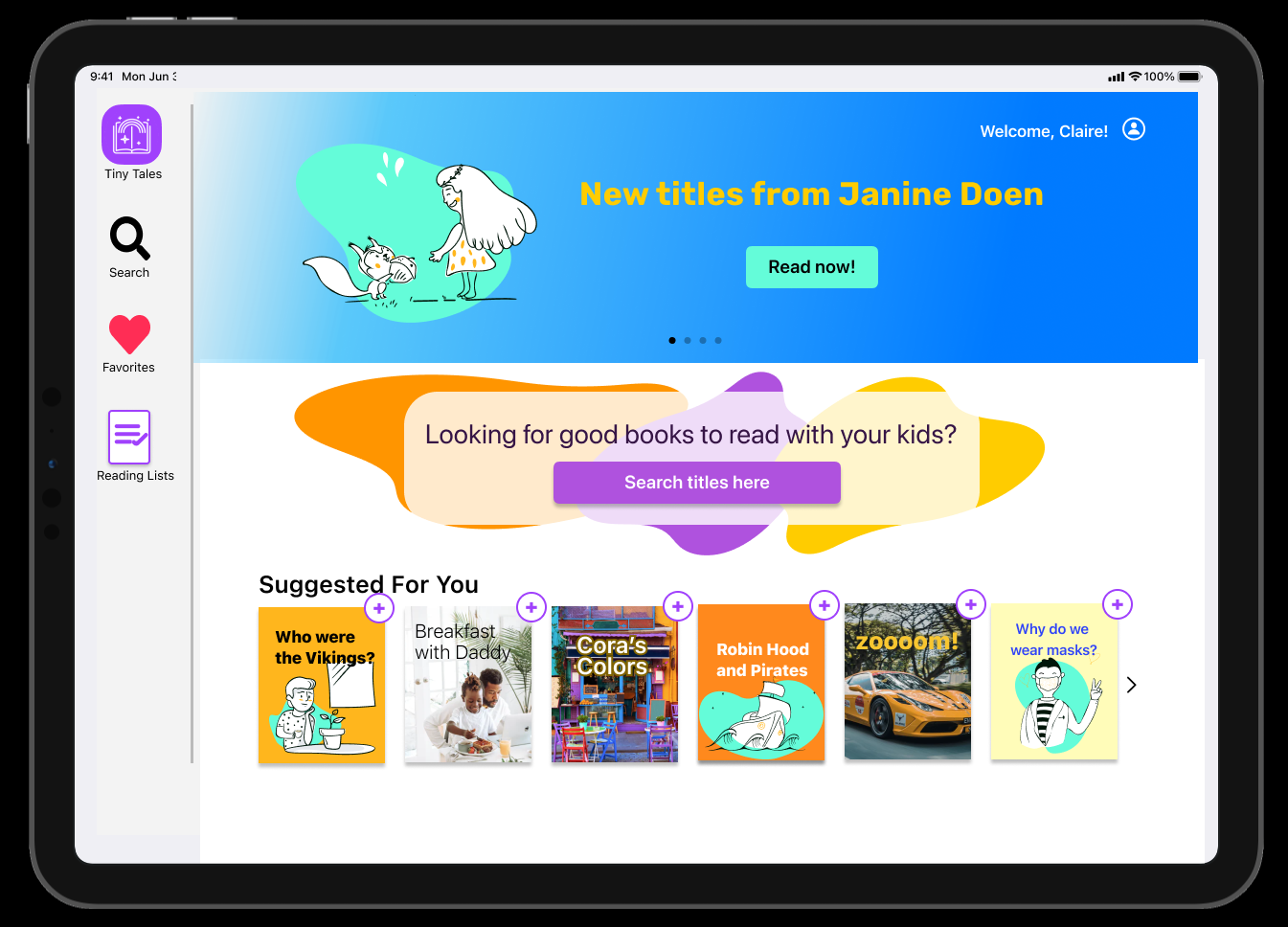
Search function for the Tiny Tales tablet or iPad app
Problem
Parents of 4-9 year olds using the Tiny Tales reading app have a hard time finding books and short stories they want to read with their kids.
Solution
Conduct a 5-day modified Google Ventures design sprint to prototype a search tool for the Tiny Tales app.
Day 1
Research:
I received a quotes from 11 parents about their priorities and a brief interview with one parent.

Persona:
Claire, a 34 year old mom of two: 6-year-old James, and 4-year-old Kayla.
Problem:
It’s hard for parents to find good stories to read to their kids that are
interesting/educational
appropriate for the age and maturity
the right length
Kids like to be involved, and can be very time intensive to find a good fit!
This app needs
good pictures
estimated time length
a summary and “browse” feature for parents with reviews
a “similar to” section to help parents find new ideas
How Might We?
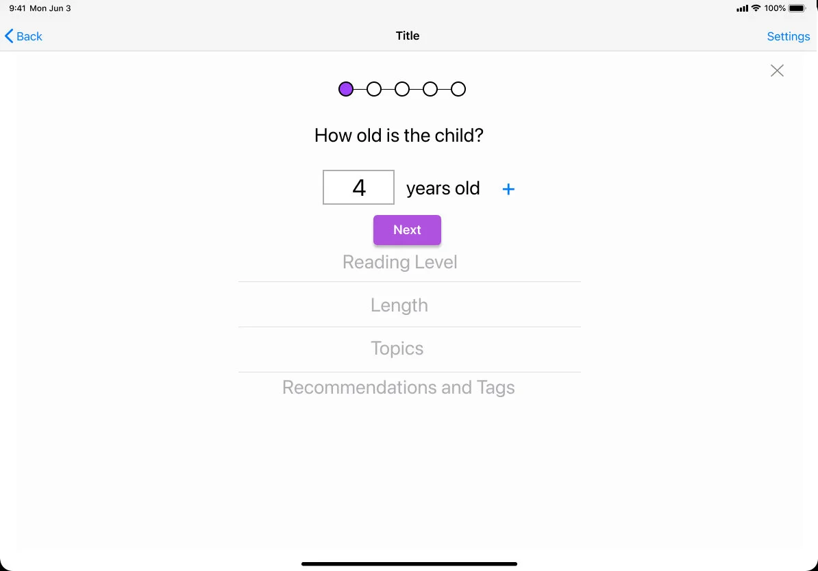
Make it easier to find options appropriate for age, level, length, and topic?
Share recommendations between people?
Help parents find similar titles to what their kids like?
Outlining Solutions:

Day 2
Lightning round research
Epic!
I looked to this popular book reader for kids for some solid ideas. This app is for kids 12 and under, and allows the parent to personalize the reading sections for each child.
Great pictures
Quiz, badge, awards
No in-app ads or purchases
Good summary section for the book, with lots of information and similar titles.
Allrecipes.com
This website provides visual searching for hundreds of recipes, and good navigation.
Good images
Powerful search engine, with lots of filter options including what ingredients you don’t want
Great summary info for each recipe with a compelling picture

Discount Tire
Step-by-step questions for the complex task of finding tires that fit your car.
Explanations where needed
Clear icons and use of color to help guide the user
You can adjust filters once results are shown
Way to compare different tires and save for later
Sketching
Crazy 8s
With all these ideas in mind, I started sketching through a Crazy 8 exercise.
And then watched some YouTube videos to watch people using tablets and understand the interactions better. I took note of page layout, visual styles, and app layout.
From my sketches and this research, I could tell the key screen would be the filter options.
Day 3
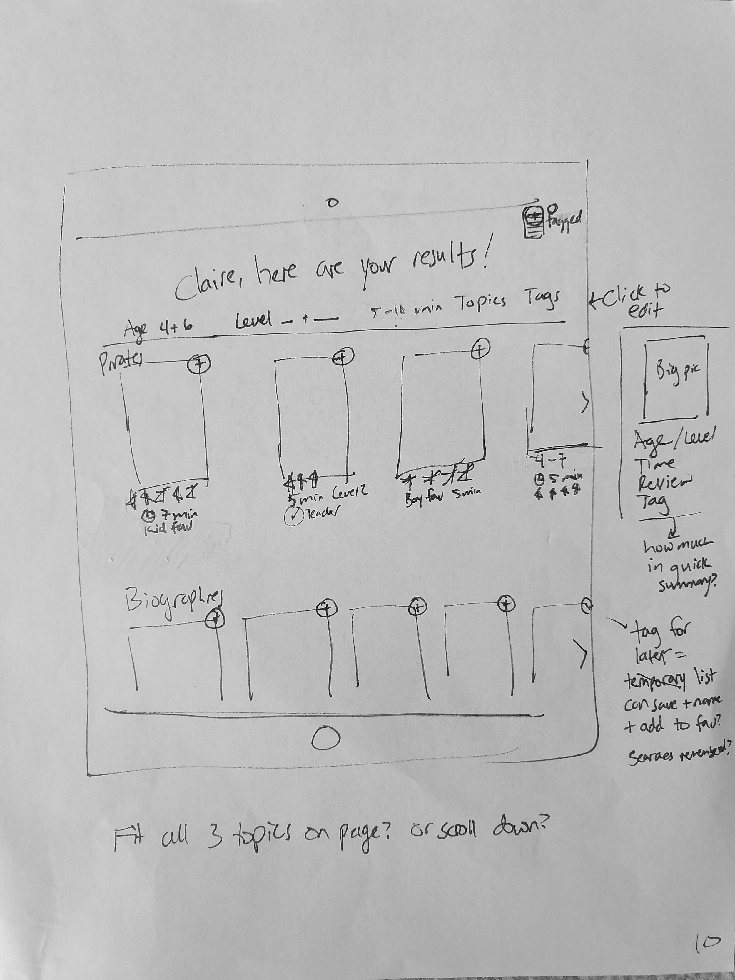
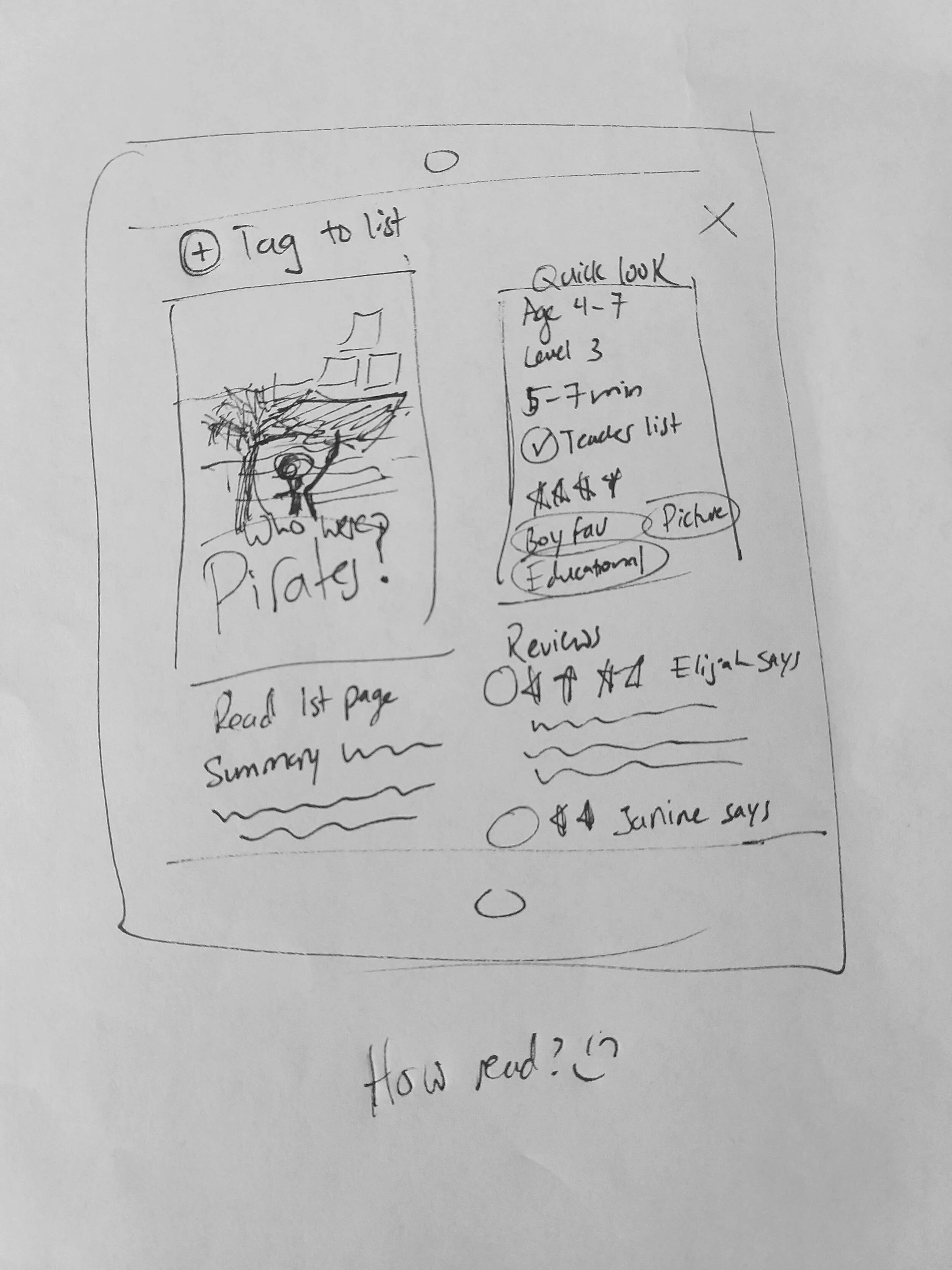
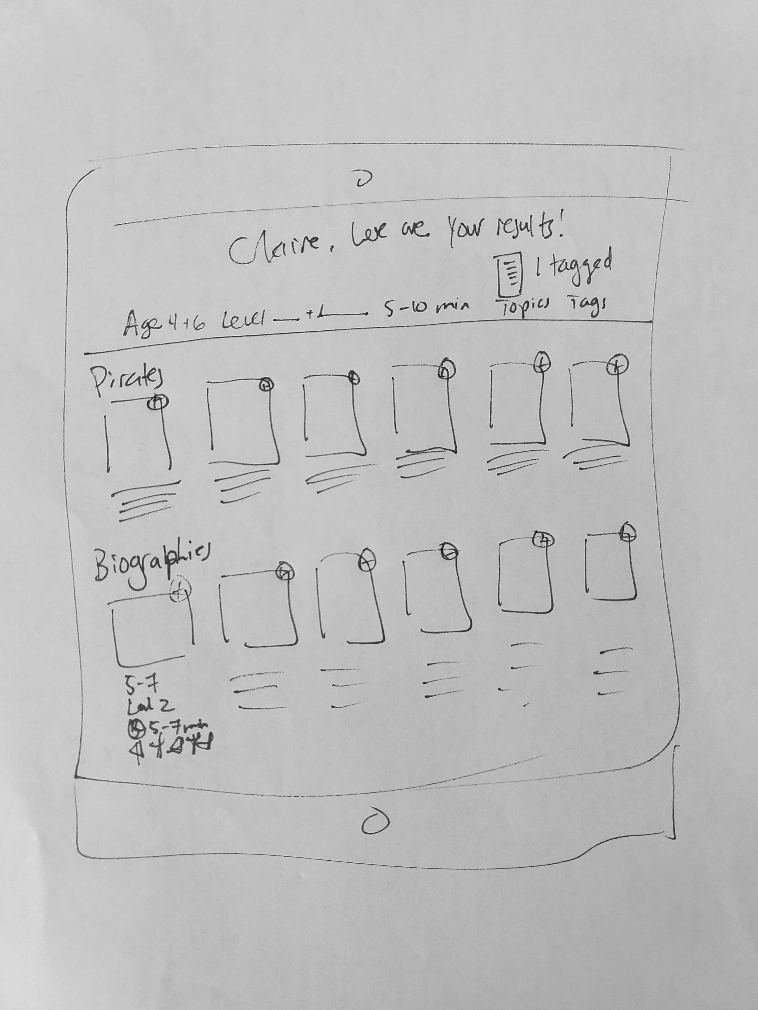
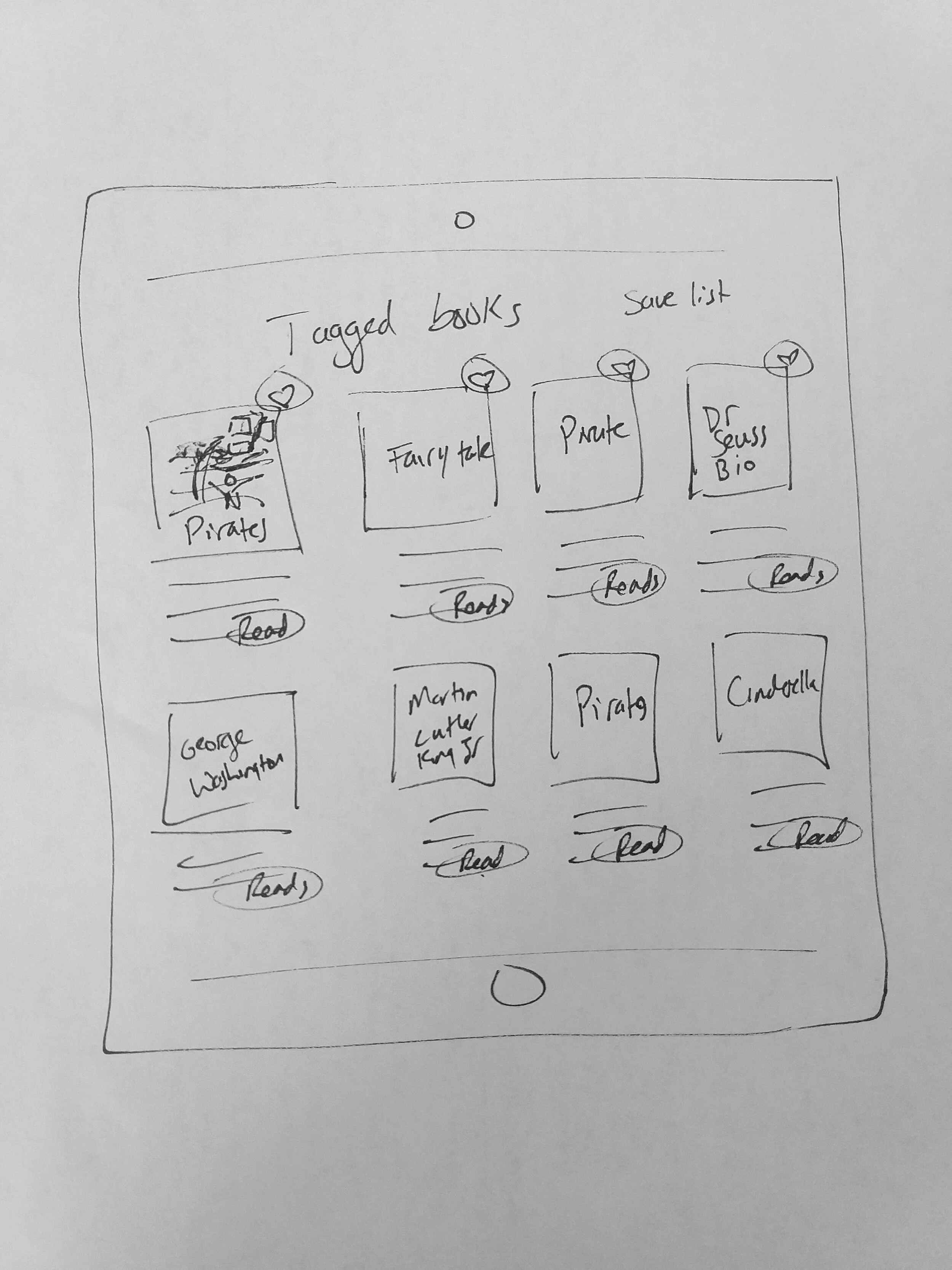
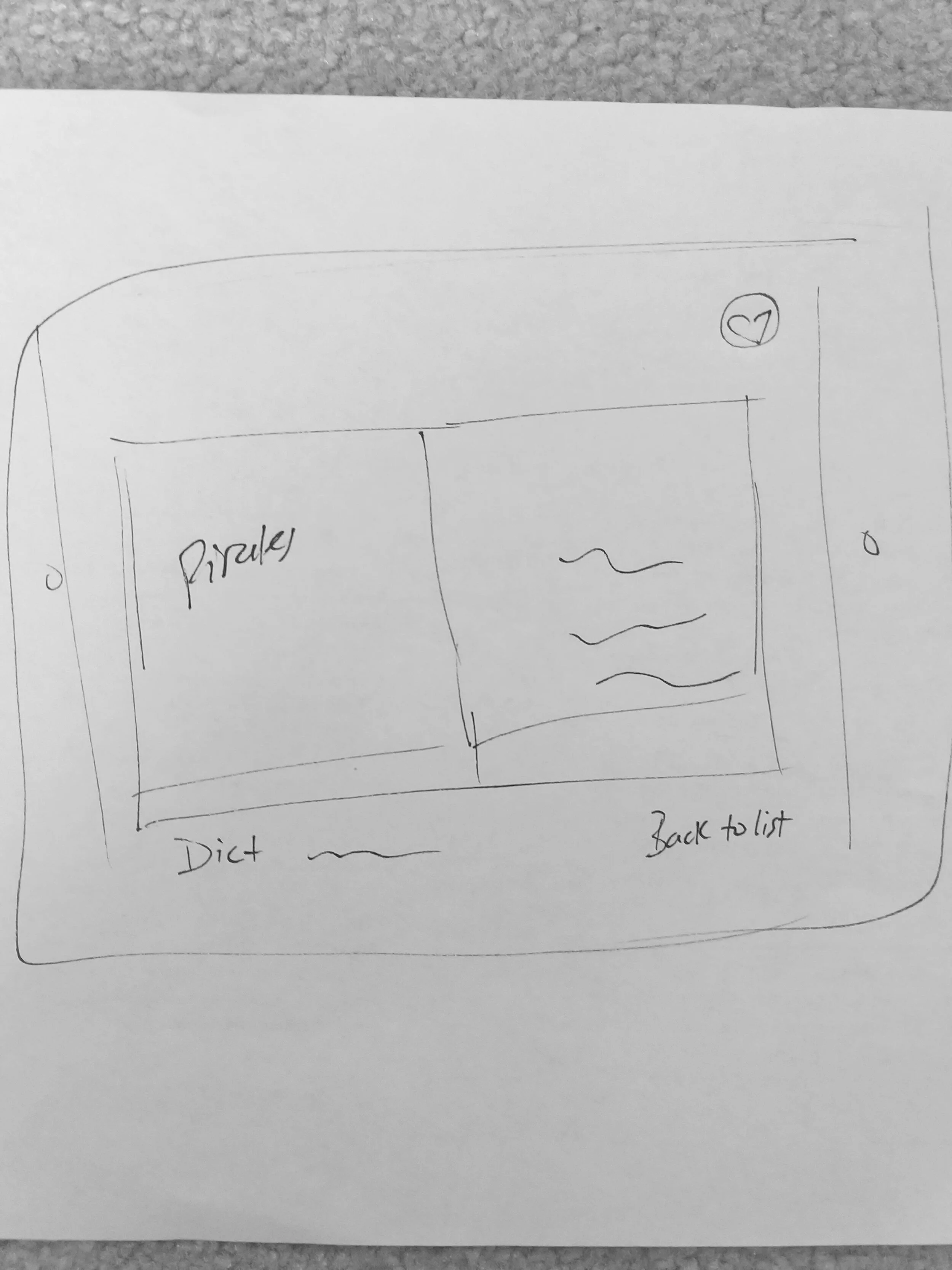
Paper mock-ups
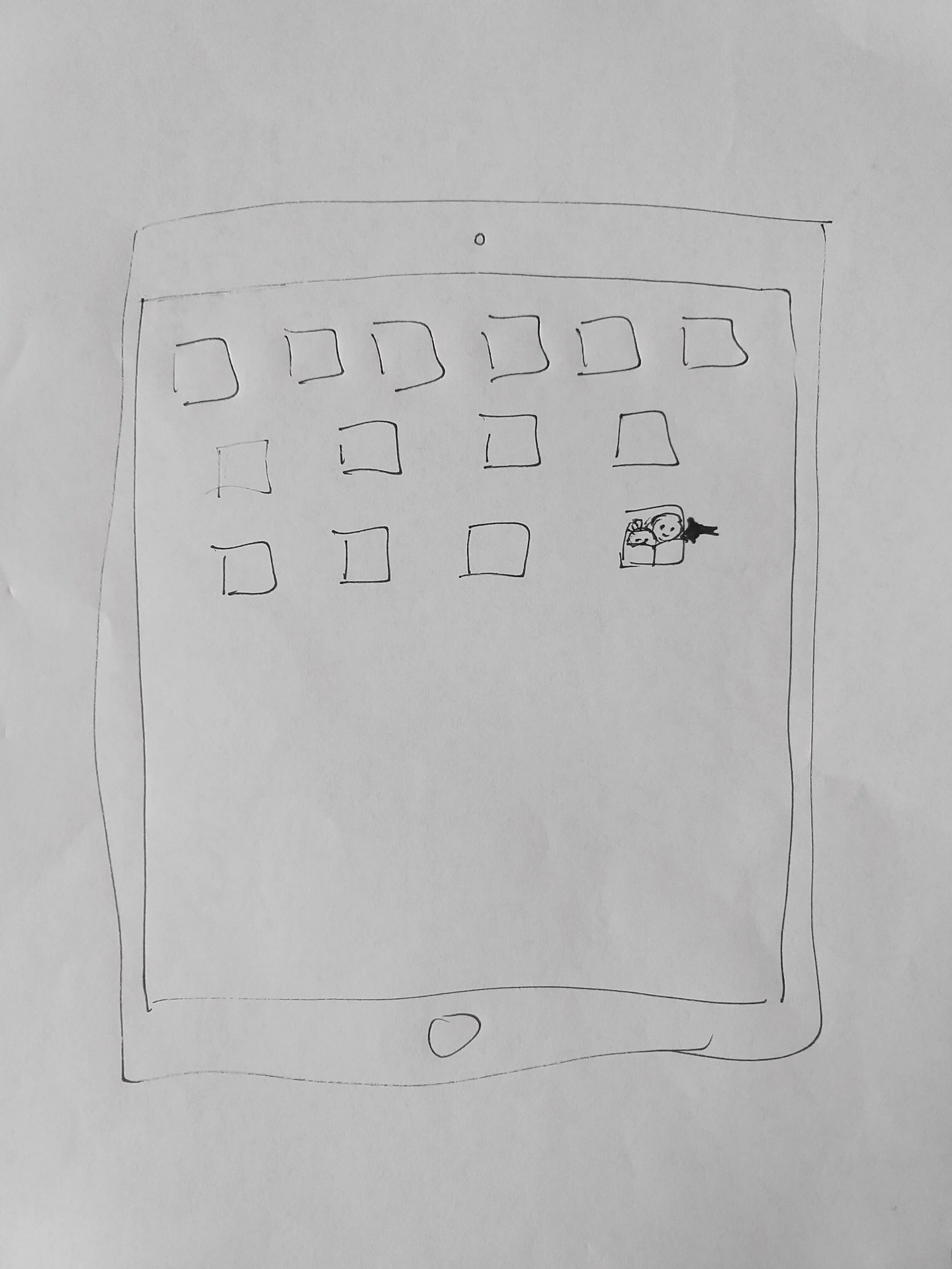
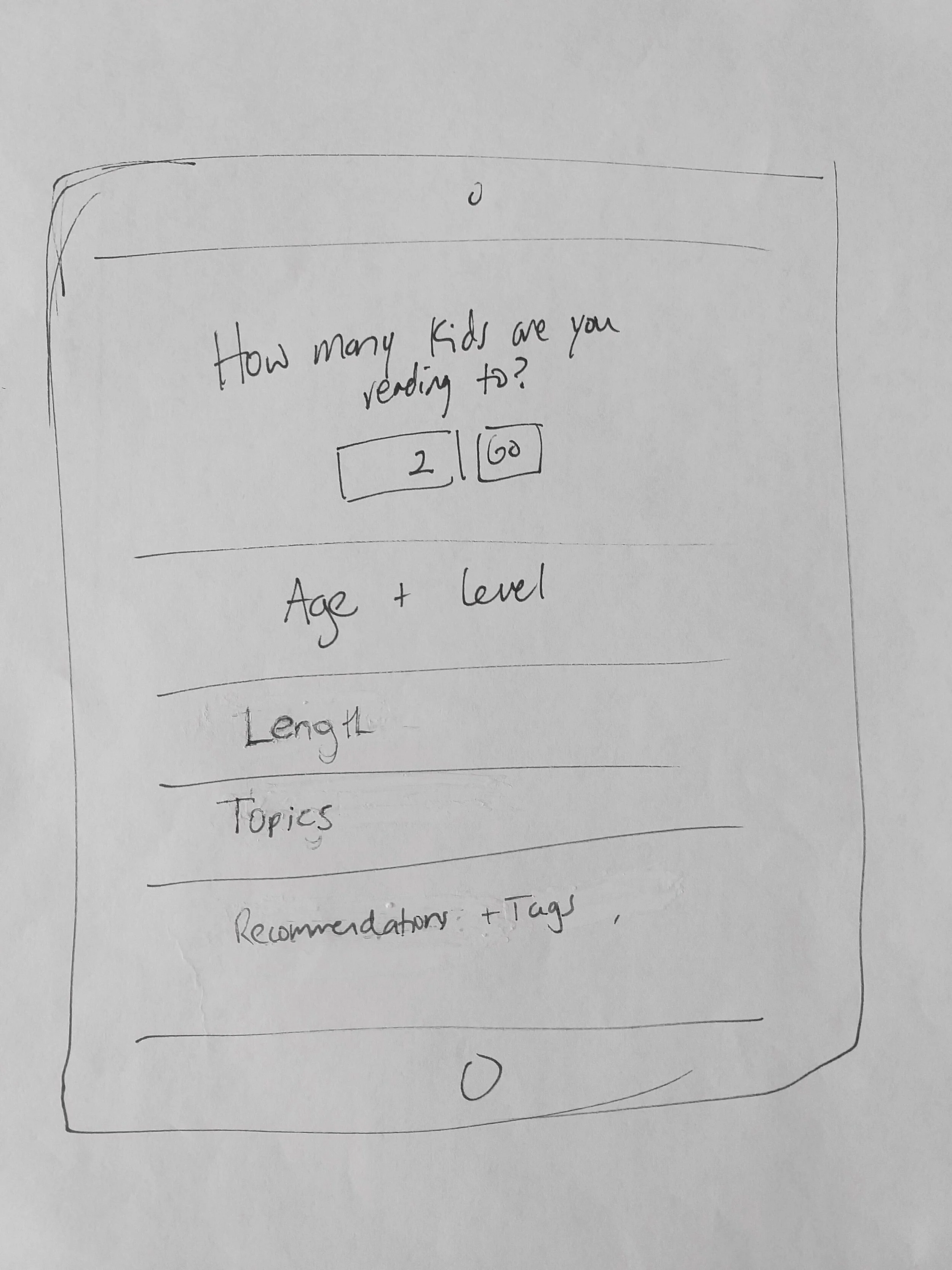
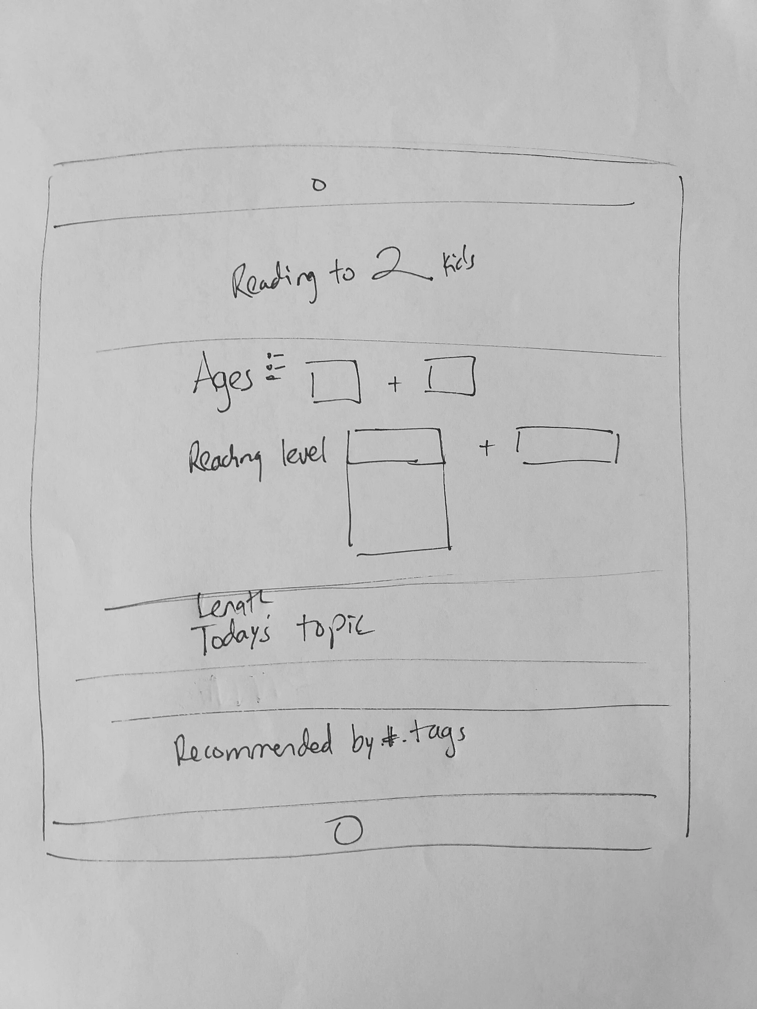
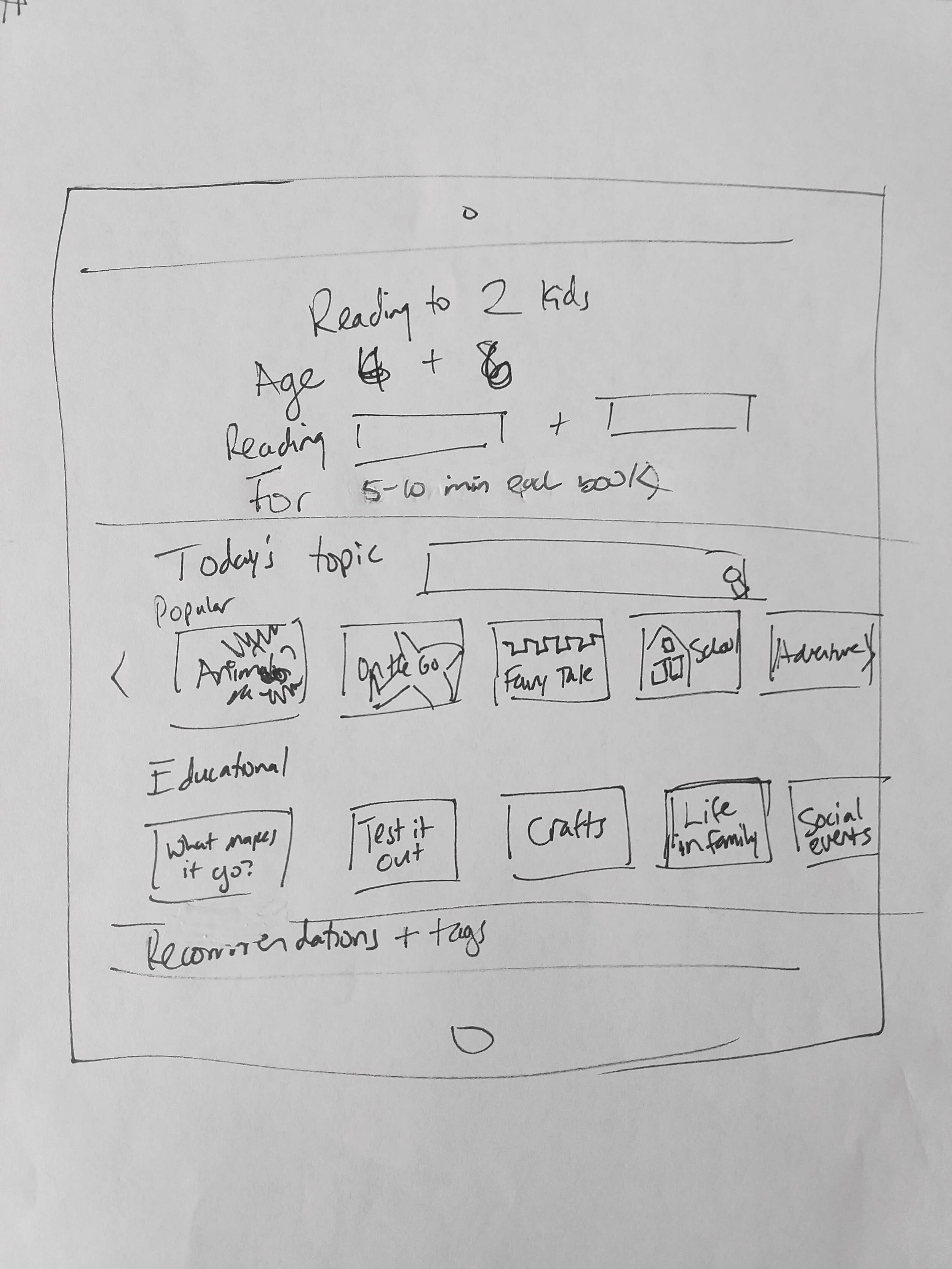
I drew mock-ups to follow my original sequence from Claire opening the app to reading a story.
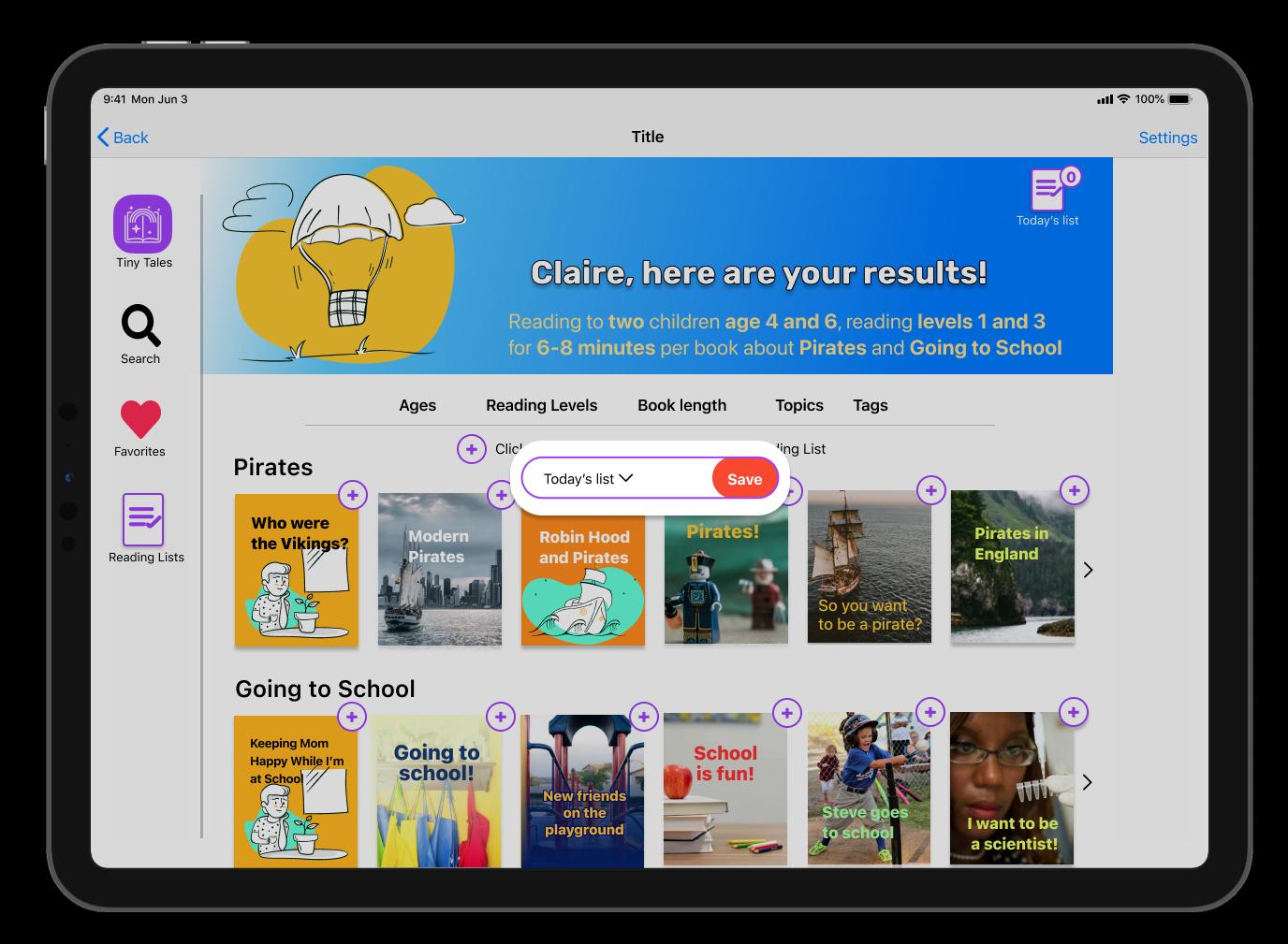
The series of questions is similar to ordering tires. I put everything on one page to make it easy for parents to navigate.
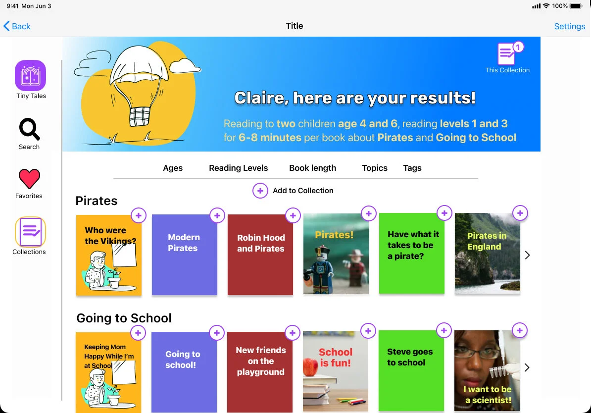
Results show in tiles similar to the Allrecipes layout.


Day 4
Prototyping
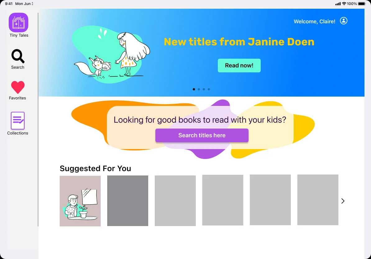
I started with brand design, using the provided logo.
I wanted to become more familiar with iOS standards, so I designed this as an iPad app. Thanks to the Figma community, I was able to resource a variety of icons, iOS guidelines, illustrations, and more. Once I understood how the iPad keyboard worked, I changed my slides to landscape mode so that the user would not have to turn it to read the book.


Day 5
Testing
I conducted 5, 30-minute user tests over the course of three days
(Yes, that’s a wibbly-wobbly definition of “Day 5”)
My five usability testers were all mothers, and four were teachers.
The key areas to address include:
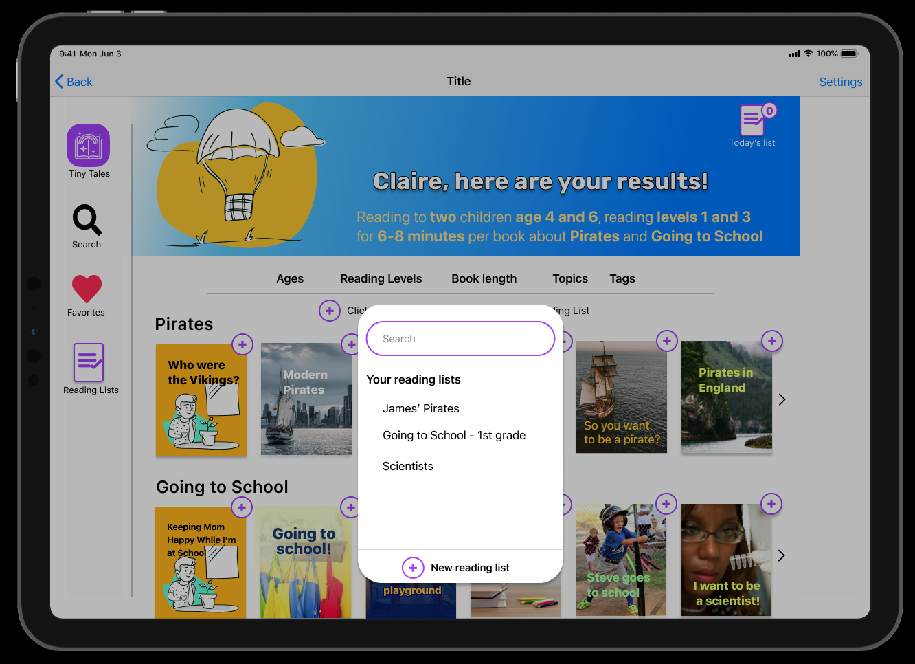
Saving books for later: Calling the book lists “collections” was confusing to almost everyone. Change to something closer to Nexflix’s “My List” or Amazon’s “Wish List” feature.
Sorting: Allow the option to sort books into different lists. Test solutions such as Pinterest’s drop-down menu, or a drag and drop option. Add an easy way to remove books too.
Reading level: Parents and grandparents often don’t know this information, and will skim the book to see if it’s a good fit. If a rubric is provided, teachers can use the information to assign different books. Conduct further research to see if a Reading Level rubric would be helpful or use descriptive terms such as “pre-reader”.
Slide order: Allow parents to skip steps. In future iterations, do A/B testing to see if putting the topic first is more helpful.
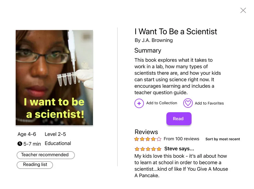
Explore the final prototype here.
Try clicking on the book “I Want To Be a Scientist” to see more information and the reading layout.


Next steps
With the design sprint completed, I’d go back to the project manager and clarify some of the information, specifically how to present reading levels.
I’d also speak with developers to see how these new ideas will fit into the existing design system.
With that feedback, I could iterate on the design and test more extensively.
Key personal takeaways
Design sprints are a team sport.
I learned a lot about how to work quickly, but missed brainstorming.
My preference is to allow time to revise projects.
Apple systems are very different from Android systems.
Tablet apps can utilize a wide variety of touch features.
Next time, I need to borrow a tablet to explore app functions in person.
User Testing is like being a tour-guide and psychologist at the same time.
My goal for my next set of testing is to write several short tasks and ask follow-up questions.