
Cope Notes User Dashboard
Internship | Mobile website | UX Design | UX Writing lead
Summary
Overview: Cope Notes is a startup that sends daily mental health texts to subscribers. Messages are written by peers, reviewed by professionals, and sent to users at strategically random times of the day. The goal is to help people recognize poor mental patterns and improve their mindset.
Problem: The current user dashboard displays as a pop-up without visual hierarchy or style. The CEO described it as “clinical” and said people have a hard time using it.
Goal: Improve the usability of the user dashboard to show value and increase customer retention.
Solution: We used research, competitor analysis, and design principles to reconfigure the user dashboard. New options to personalize settings and designs increase the value for the user while decreasing the time it takes to complete tasks.
What I learned: A good team means 1+1+1 = 6
Focus on the finish line to avoid taking on too much.
Define UX terms for stakeholders to on the same page.
Good design and copy change the product from average to amazing.
Team: My primary roles were in UX Design and as the UX Writing lead. I worked with Phil Lofton (UX Research lead), and Laura Dixon (UI Design lead).
Timeline: April 14 - May 19, 2021

“We didn’t come to [this Springboard team] to shore up user experience — we came to change it. This will be the star of Cope Notes show. I can see us encouraging people to use the updated app to see how cool it is. This boosts engagement, retention, and brand affinity.” - Johnny Crowder, Cope Notes CEO
Project Plan and timeline
At the initial meeting, the Cope Notes CEO and developer met with the team. We clarified project goals for a successful finish. Although our goal was go finish in a month, we allowed an extra week for the official handoff.
To succeed we needed to give the User Dashboard a makeover. The Cope Notes team provided us with current branding information, access to several dummy accounts, and an overview of current problems and concerns. We got to work planning the project structure and researching the problem. I also took some time to dig into the Cope Notes website to understand what their current layout and brand looked like.

Research
Competitor Analysis
I took screenshots from competitor dashboards. These included smaller phone services (Google Fi and Ting), mental health apps mentioned in research (Headspace, Down Dog), and companies with good design (Spotify, Google).
Top things we learned:
Show users why they need to create an account
Stay consistent between mobile and desktop
Use clear language with calls to action


Heuristic Analysis
I used screenshots of the current user dashboard and noted the usability aspects that are working, and those that need to be changed. I rated features on a red, yellow, green scale for ease of use, security, design style, and cognitive load.
Main problem areas:
Floating footer
Popup style of user dashboard confusing
Security verification happens at the end of the process instead of the beginning
No visual hierarchy to distinguish sections
Primary Research
Our team sent out a survey and conducted usability tests. Results showed a lot of confusion around cancellation options and how to customize when texts come during the day. People also wanted to reduce scrolling on the menu.

“Your account settings should be like payment information, username, email, change password, and then there should be a separate section that has like all the other sort of details that come to surface that you can set and adjust.”
– Anonymous usability tester
Sketching, Information Architecture, and Mid-fidelty wireframes
Sketching
During our second week, we presented our initial discoveries to the client and received feedback. We asked a lot of questions, brainstormed solutions, and compiled areas to focus on. Key areas to improve included: account security, visual hierarchy, and cognitive load.
I sketched user flow ideas in the Crazy 8 format to get ideas on paper as fast as possible.


Information Architecture
I created a sitemap of the different elements we wanted to include in the wireframe. Purple shows the main pages, with links to the pages in green.
At this stage we wondered if we would have time to create onboarding screens, so I used red dots to highlight the features we wanted to cover.

Mid fidelity: Wireframes, prototype, testing
Wireflows
For our first version, we wanted to add some good visual hierarchy as well as some key areas from the initial usability testing.
Security at the beginning of the sign-in process.
The option to personalize which categories texts are selected from.
Ways to manage multiple accounts — technically for a group dashboard, but an easy feature to add to the hamburger menu for added value for the client.


Key feedback from testing on this prototype:
Confusion why static features like the phone number are featured at the top of the dashboard.
Irritation at how much scrolling they had to do.
Confusion at the difference between cancelling the account and deleting all information.
Next version: Create another screen for settings.

“It's kind of surprising that my login information is still right there, it makes me feel like I'm still logging in, and then I wasn't really sure what to click on with the (time adjustment) icons though I did love them.”
— Anonymous usability tester
High fidelity, revised sitemap, and brand guidelines
Project meeting with client
Our biggest struggle was scope creep. During our meeting with the client, I got sidetracked asking “what if” questions and at the end we struggled to narrow down our focus. In our team meeting, we pulled back to a manageable level of features and touched base with the client through Slack.
What presents the biggest value for users?
What is Cope Notes already offering that we can highlight?
What are competitor standards?
It was great practice to know when to dream big and when to scale down.
Sitemap V2
Based on the user feedback from our wireframes, we realized we needed to create a separate settings page. I revised our sitemap to reflect the changes.
One of the main challenges was to analyze the most useful features to include in the new feature page of the dashboard. Topic categories and time window for texts were already available, and options to share with friends fit with competitor research. I advocated for the journal feature, since it maximizes a key way users interact with the service. We saved it for the end, but were able to include it.

High fidelity mockups V1
Our main priority for this version was to begin brand design and work with the new split between the dashboard feature page and settings page.
Account names without privacy issues: We discussed nicknames with the client but ultimately stuck with a phone number designation.
Easy to cancel: It’s important for this to be easy to find, but we also made it easy to pause and get help if people are just frustrated.
Imagery: We used some imagery from the website for continuity, but needed to create some new content.
The Cope Notes CEO loved the direction, but thought it felt unprofessional. He asked for an upgraded UI to bring everything together.


Key feedback from testing on this prototype:
One person wasn’t able to find where to cancel their subscription. This was a big red flag since people may not use the account except for when they want to make major changes.
People appreciated the achievement and time sections, but weren’t sure how to use them.
Another user said the background and button size made this easy to navigate.
Next version: Upgrade the UI and make cancellation easier to find.

“I think it all just blended in a little bit for me. That's my one gripe. I think I want to figure out some hierarchy, like what differentiates each section maybe. I think it's that the white background is just very…I mean it's very dominant.”
— Anonymous usability tester
Brand and style guides
I worked with our team’s UI Lead, Laura Dizon, to research the current Cope Notes brand. We wanted to promote consistency between the website, this user dashboard, and future projects. While I helped with all of this guide, I especially focused on the brand attributes and copy guidelines.


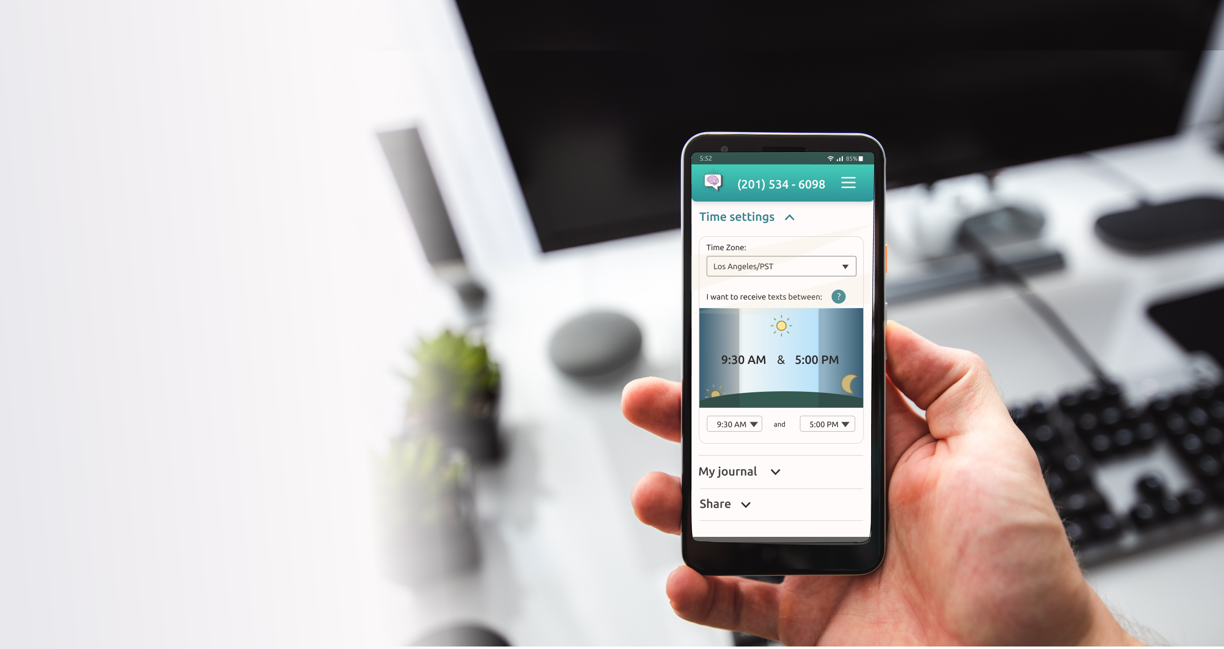
High fidelity: final version
For this last iteration, we wanted to take the design to the next level. Along with UX adjustments, my job was to work with the CEO to discuss the microcopy. We talked through the best words and phrases to communicate clearly in the brand voice, within the space we had in the design. Key areas included:
Section headings
Calls to action
Section descriptions
Here’s the final prototype!
Key feedback from testing on this prototype:
It doesn’t make sense that people would want to get more texts about anger - adjust the topic names to be strength-based.
One person was still not able to find the cancellation section. This is something to continue evaluating.
More buttons to indicate interactive areas will be helpful.
Next version: Continue to refine the copy and research why people are having trouble cancelling.

“I like the counter of how many days I've been doing this and then maybe the implication that I might be gaining months or something for my achievements, then it's kind of cool.”
— Anonymous usability tester
Next steps & final thoughts
Added value:
Increased security, decreased frustration by moving account verification to the front
Greater options for personalization (texting times, message categories, and journaling)
Easier to find options
Standardized hamburger menu and footer add streamlined navigation
Next steps
We presented final designs to the client and shared the Figma file optimized for the developer along with a PDF version of the brand system and a folder of research results.
The next level of this is to adapt it for group users (Group owners and members). This will take further research to understand these users, and what needs they have.
Group owners: Ease of adjusting multiple accounts
Group members: Privacy and security of account but also able to contact group owner if there is a payment problem.
Final thoughts
This project was one of the rare golden moments where a dynamic team came together to make big changes in a short period of time.
Team communication- We set up a Slack channel, met weekly to discuss next steps after client meetings, and ran ideas past each other before going to the client. This quickly established trust.
Project scope - It’s easy for projects to grow. I learned to focus on the final goal and let some golden dreams wait.
Working with developers - The Cope Notes developer was involved at every stage of the project. We asked questions to check viability, and he told us to dream big and then he could always let us know if something wouldn’t work. I want to keep learning about the development side.