

City Welcome
Personal project | Mobile website | UX Research, Information Architecture, UX Design, UX Writing, UI Design
Summary
City Welcome is a hypothetical startup event company. Locals introduce people to their community by offering tours in person, self-guided, and online.
Problem: A start-up company launched a product to help newcomers to a city meet new friends in person and the response rate is at 20%. Covid restrictions are in full swing, and the company is struggling.
Goal: Increase the conversion of people who sign up for an event and actually attend. Adjust the business model to include Covid restrictions.
Solution:
Expand the user focus from newcomers to a city to anyone interested in an area.
Use a variety of tour options to expand options during Covid restrictions.
Design for the tourguide persona —locals who are able to make money through tours.
My role: User Research, Information Architecture, UX Strategy, UX Design, Prototyping, UI Design
Timeline: February 5 - March 25, 2021
Starting user persona:
Middle-class men and women, 32 - 55 years old
Use both desktop and mobile
Recently relocated to a new city.
HMW: How can we help people who have just moved step out and make new friends?
Project Plan and timeline
I had 90 hours for this challenge and completed it between February 5 - March 25, 2021.
Research
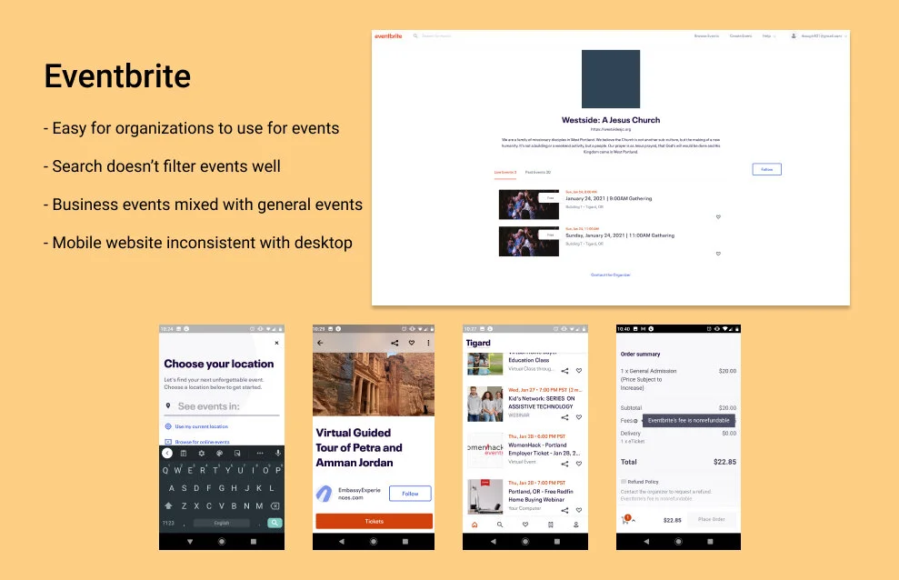
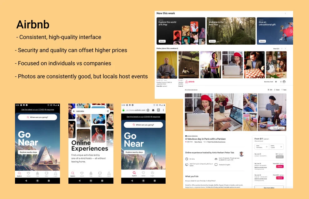
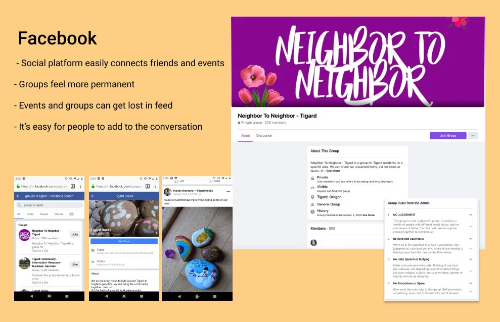
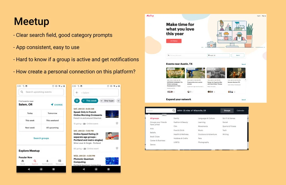
Competitor Analysis
My design needs
clear rules for organizing photos and information
a good search filter
consistency between mobile and desktop websites
Quantitative Research
My goal was to answer these questions in my research:
Why do people move?
What makes an event attractive (or not)?
What values or goals are people trying to fulfill with events?
I looked into US demographics, statistics on who is moving, research covering online events, and testimonial articles on who is moving and why. Read the full report here.
Primary Research

I sent out this survey to Slack groups and Facebook friends. From those responses, I interviewed three people from the target user group.
Affinity Map
Along with time and location, concern about Covid is one of the biggest factors why people aren’t attending events right now.
“I’m doing different activities than what I was doing before [Covid].”
And online events aren’t making up the difference.
“TV taught us that people in screens aren’t actually there.”
Refining the problem
Through my research, I realized the company’s user focus was too narrow.
People don’t stay “newcomers” for very long
What is the incentive for local people to attend or organize events?
How can you adjust for Covid lockdowns with different requirements?
The market for online “events” and talks feels saturated. What niche can a startup company fill?
I went back to my competitor analysis:
Airbnb has a great way of introducing travelers to new places through local people who offer tips, recommendations, and answers. How can my startup do the same thing in local areas?

I brainstormed with my mentor to narrow down my ideas.
User needs:
Newcomers/people who are unconnected to a city need information and a place to socialize
Locals have knowledge and need money
Startups need simple solutions with big potential
The solution needed to have online and in-person hybrid for viability during and after Covid restrictions.
What is a way to get out of the house and meet people during covid restrictions as an individual or family?
A virtual map with a chat feature?
Activities offered to friend groups online like simultaneous cooking?
Walking tours? Yes!
I developed the City Welcome platform to help locals share their knowledge through a tour and make some money without big monthly fees. They can make their own schedule and pay a flat percentage off of ticket prices to the company. Newcomers or people who want to learn more about an area can enjoy unique tour experiences with these locals. There are options for tours in-person, self-guided, and online.
My mentor’s advice as I pivoted to the MVP — keep it simple and make sure the search filters are robust.
User personas
I created two personas using quotes from my user interviews.
Information Architecture & Ideation
User Journey Map
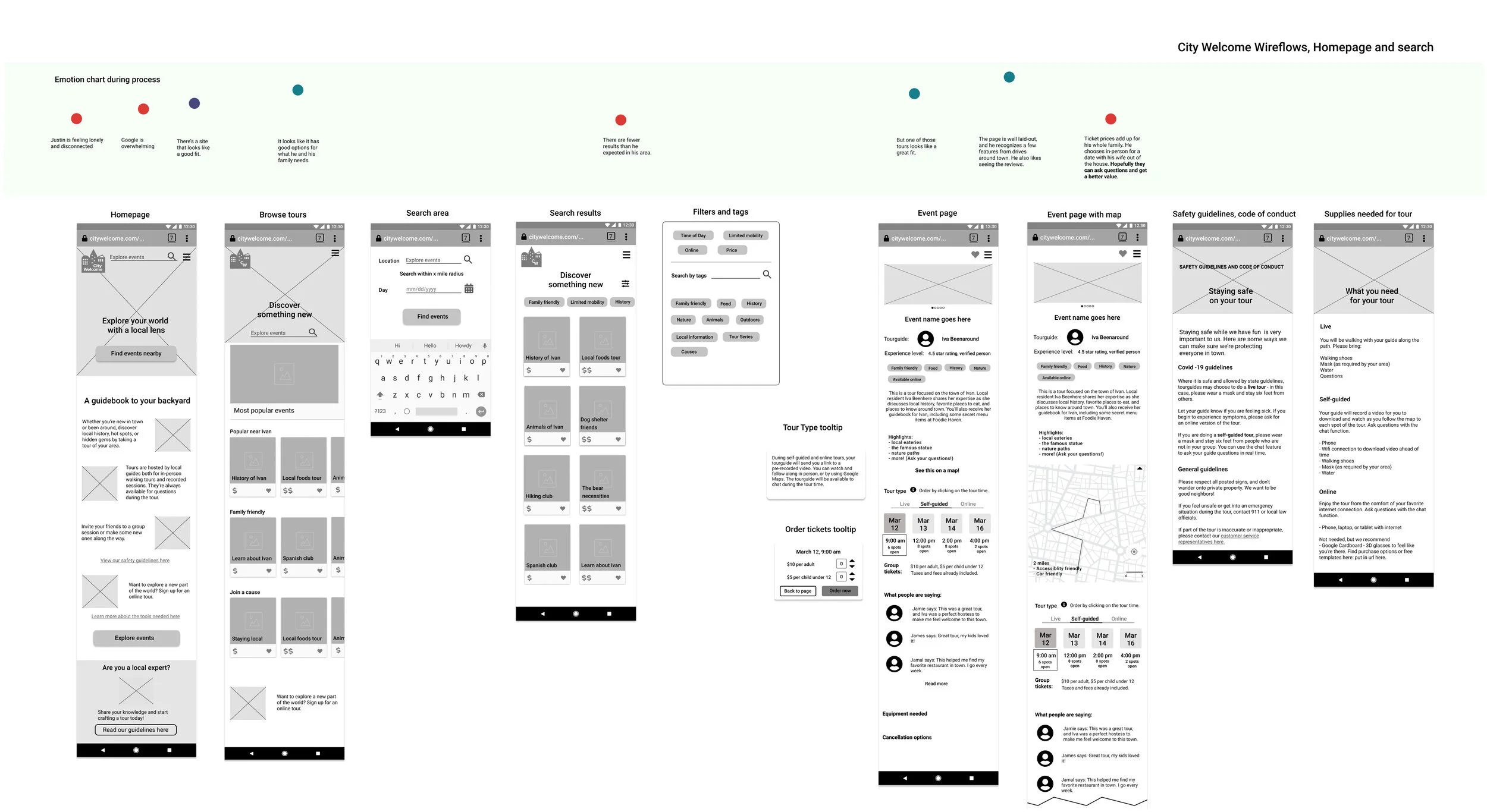
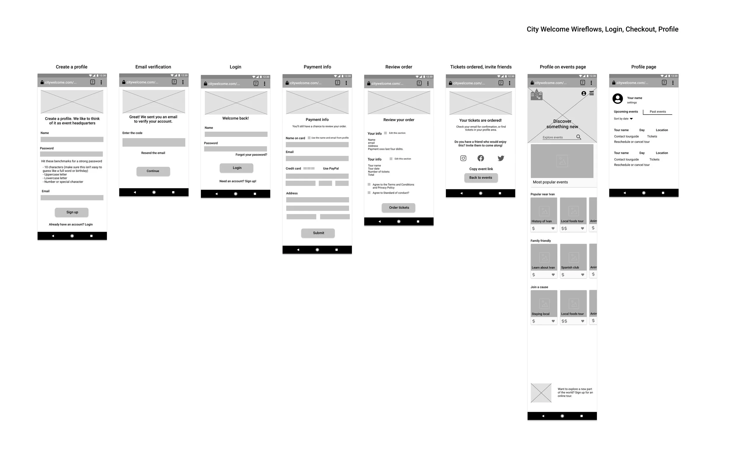
For this User Journey map, I plotted the steps my persona Justin would take when using City Welcome for the first time.
I found it easiest to complete this step while also sketching low fidelity versions.
Mobile-first design will allow me to scale for tablet and desktop break points while making sure the interfaces are consistent.
What needs to be in my MVP?
Easy search options.
Flexibility in tour types and times.
Clear communication, including a robust event page and rescheduling info
Easy sign-up and payment options
Social media links to easily share with friends and family
Because this start-up had a low conversion rate for their initial product, I included several incentives to attend:
Clear communication helps people trust this company, and an individual tourguide gives personal connection.
Users commit to attend by purchasing tickets, and receive multiple follow-up emails or texts to remind them of the tour day.
Rescheduling options are fair for both the guide and user.
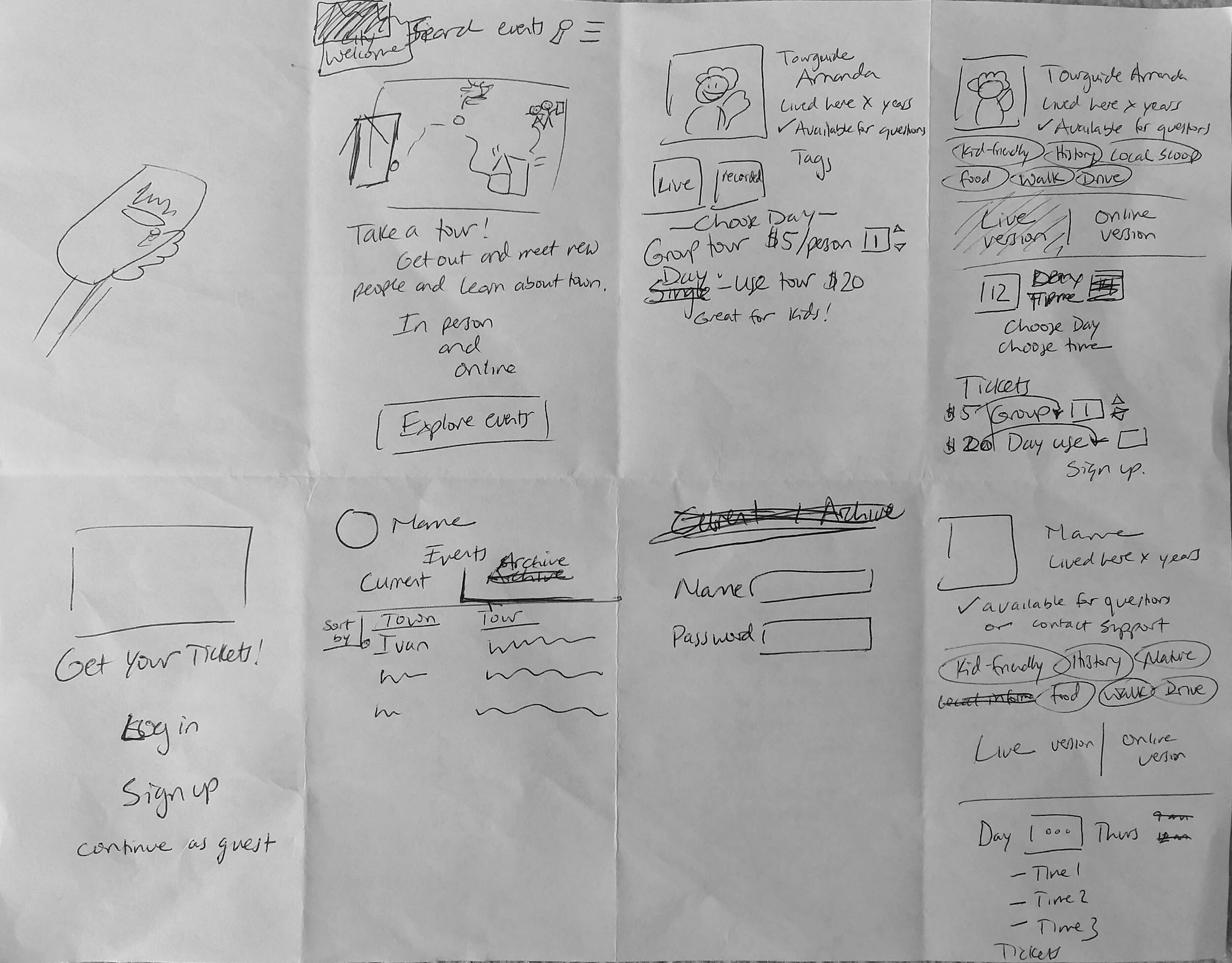
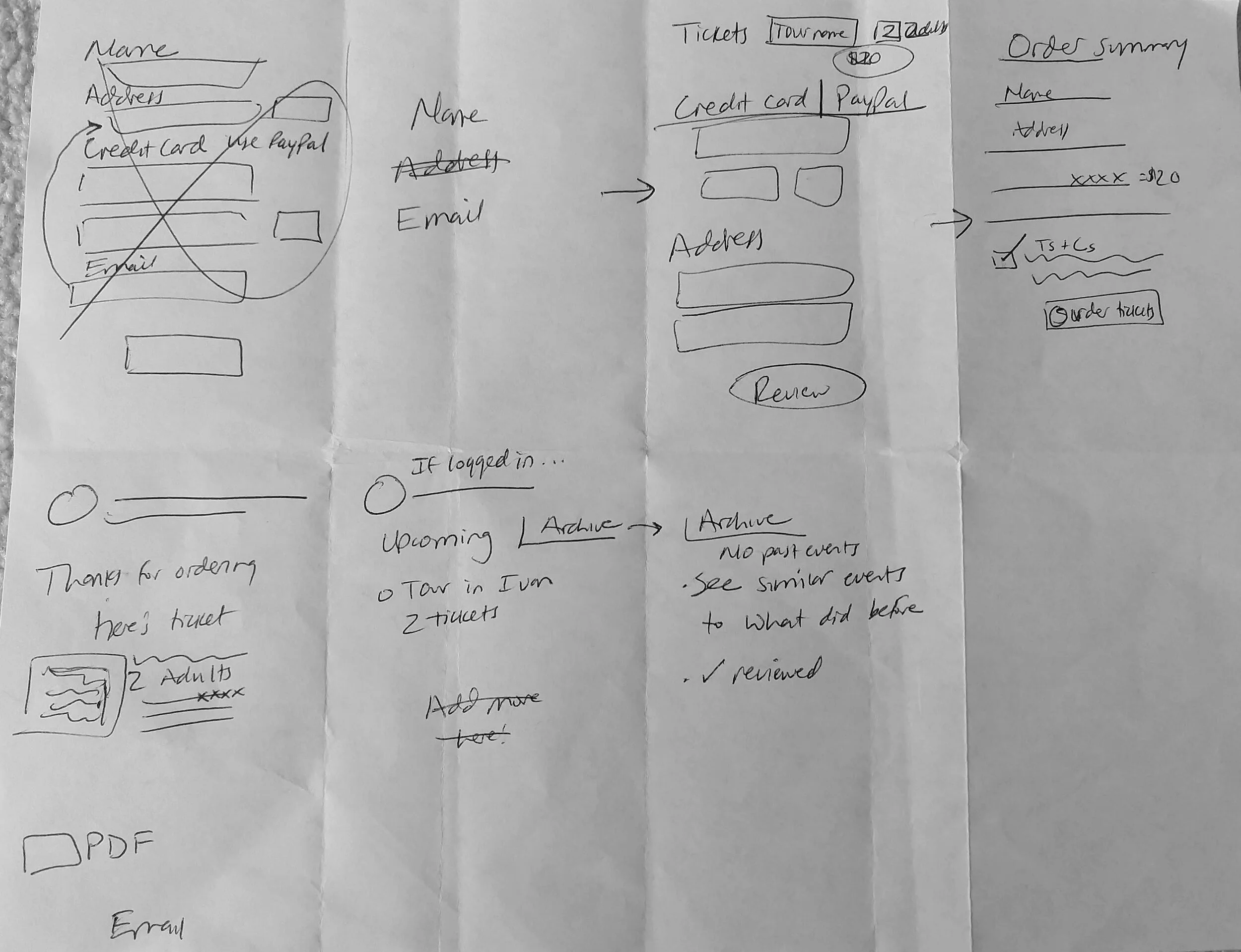
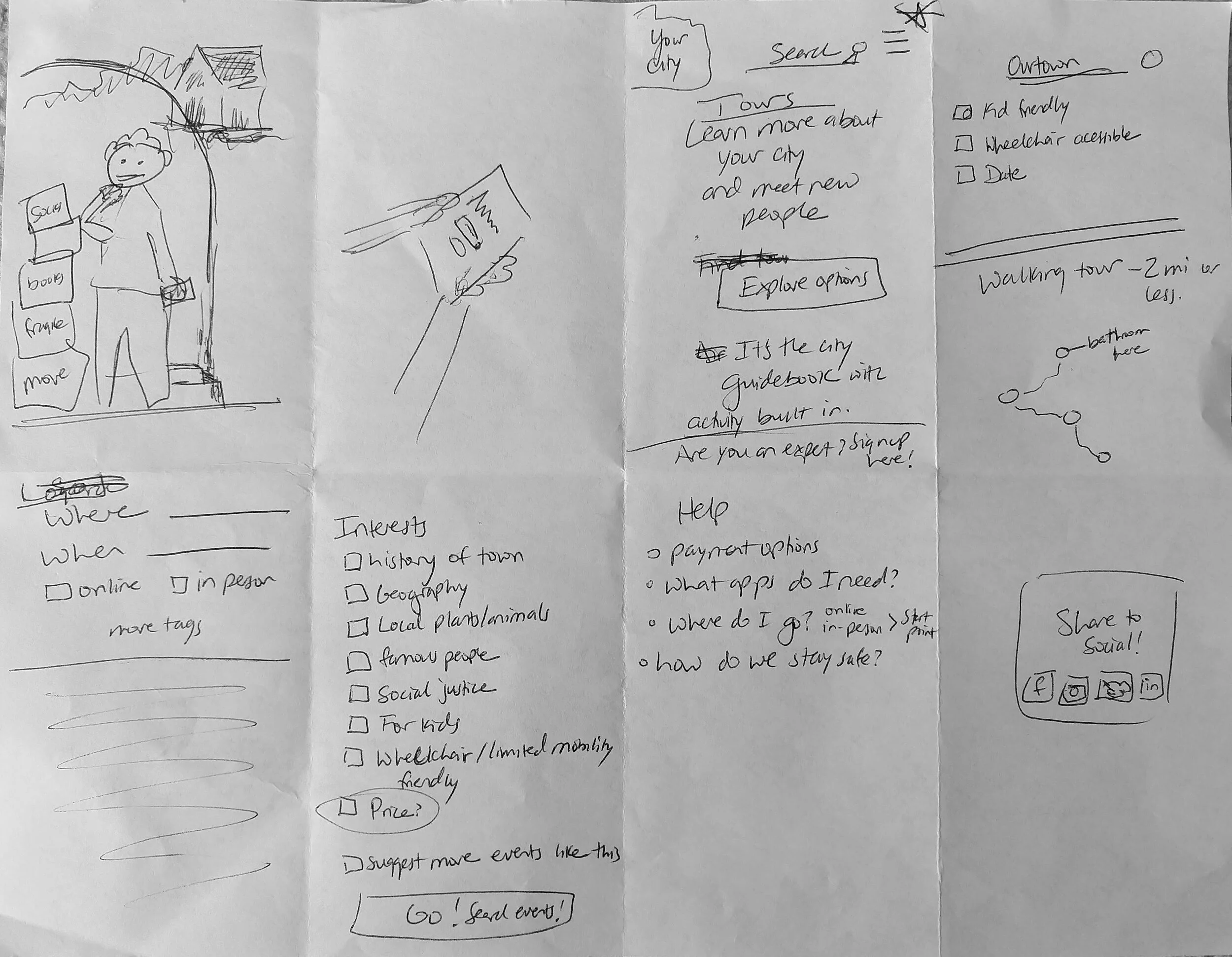
Sketches
I sketched user flow ideas in the Crazy 8 format to get ideas on paper as fast as possible.
Mid fidelity: Wireframes, prototype, testing
Wireflows
Because of time constraints, I moved into wireframes and created a prototype to test the usability.

Technical difficulties…
Ice storms don’t get along with power lines. I was out of power for nine days when I was supposed to schedule my usability tests. During this time, I had to prioritize a separate group project, so I brainstormed good usability tasks. My goal was to help each person understand the problem without asking leading questions.
I was also able to ask a family member to test my prototype and realized it was too complex for a 30-minute session.
In the end, this forced break helped me think on my feet in unusual circumstances.
Mid fidelity usability tests
I tested 5 people, 3 from the company’s specific user group.
The most important feedback I received:
Clarify why the profile is helpful and create a landing page to organize past and current events
The word “event” is confusing — use “tour” exclusively.
Change the checkout screens to use progressive disclosure
Brand design
City Welcome is friendly, casual, and engaging. I used the complimentary colors purple and yellow as my main colors, with bright accents.


High fidelity: Mock-ups, prototype, testing
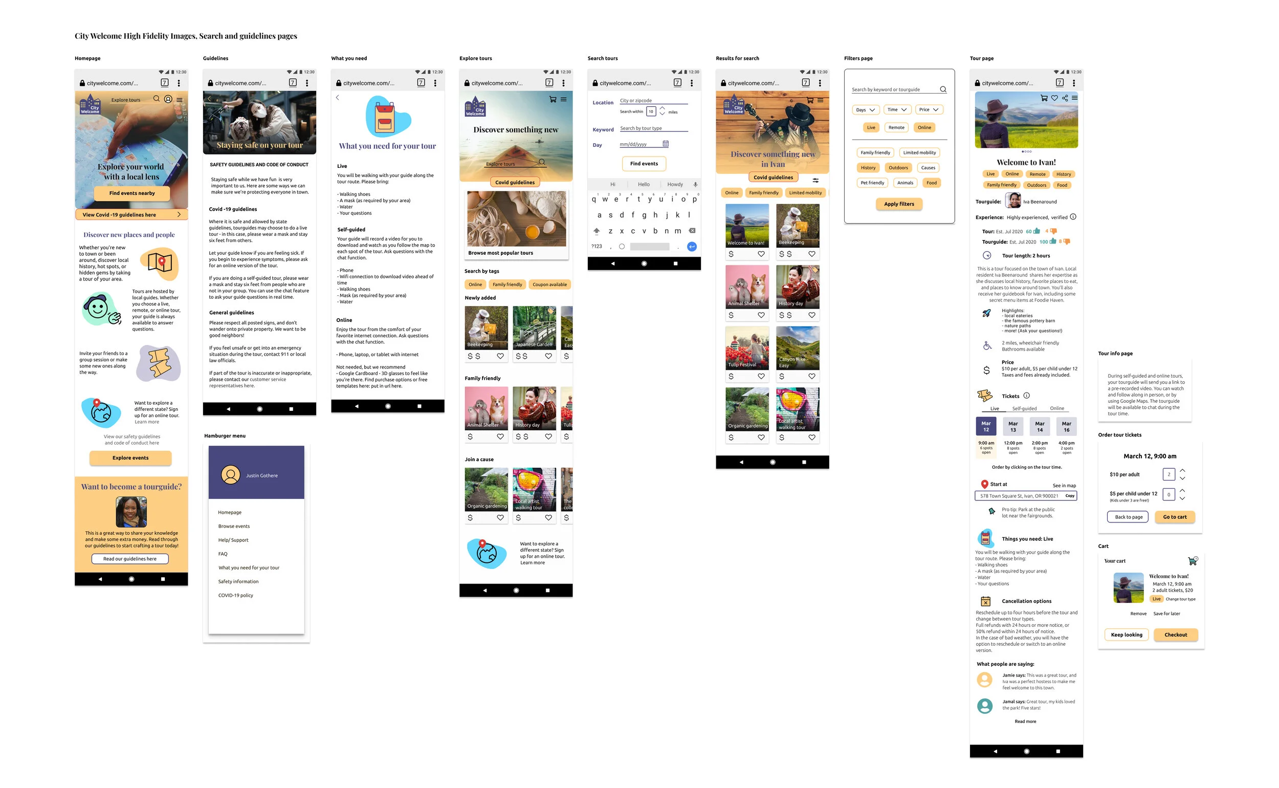
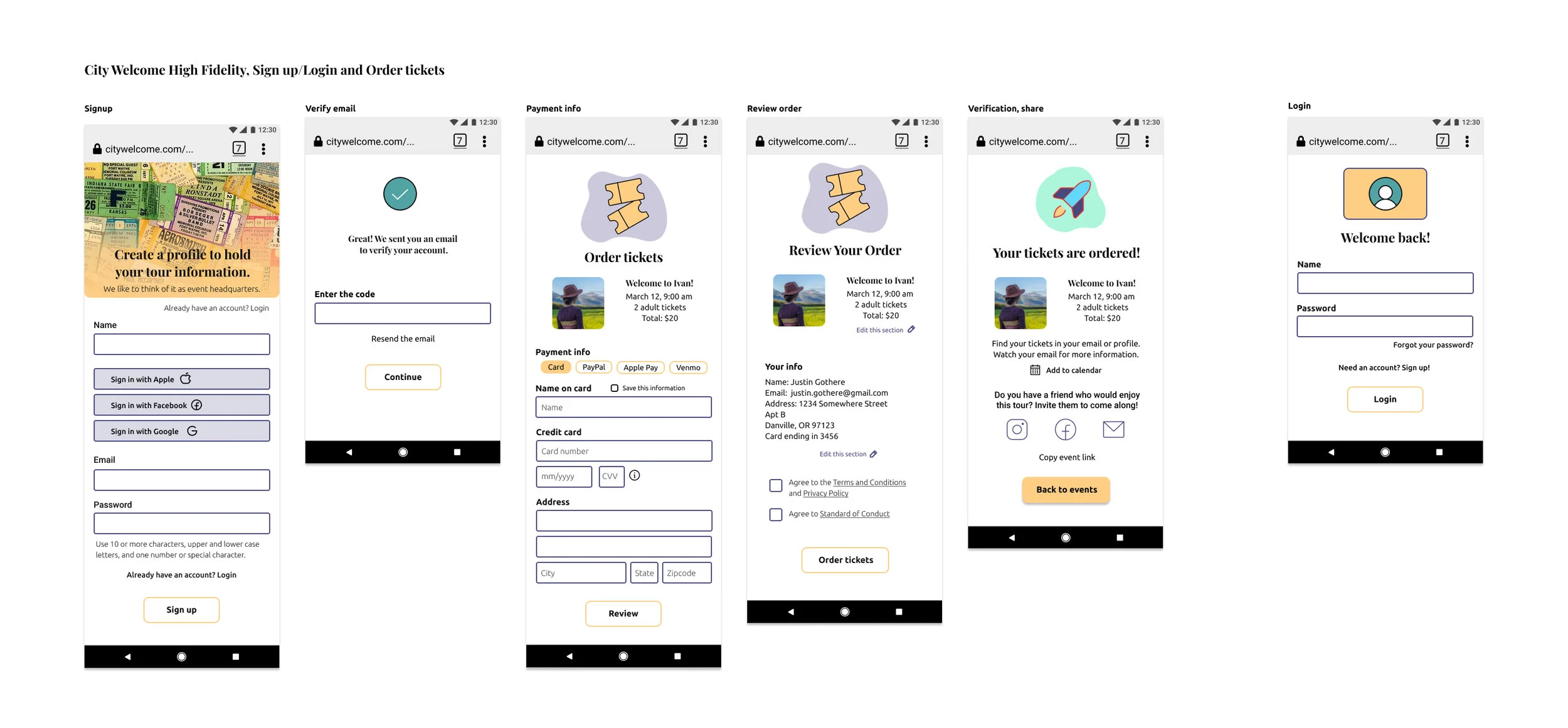
High fidelity mockups


High fidelity usability tests
I tested 4 people, 3 from the company’s specific user group.
The most important feedback I received:
Use a checkout icon so people can browse more tours after selecting tickets
The map is confusing and there is no address available
Use color/icons to make the event page easier to read
Final high fidelity prototype
Here’s a video walking through my final prototype. You can also explore it here.
Next steps & final thoughts
Next steps
At this point, I would pause for a good conversation with developers and stakeholders to make sure this initial design is reaching goals. With a solid mobile prototype in place, I’d then:
Create a desktop version of the website
Test the process of rescheduling
Create the tour guide's side of the website
Add a feature to compare events
Final thoughts
I learned a lot during this process about time management. Here are some other highlights:
When ice storms happen, make your best plan and adjust.
Take time to craft good tasks for usability tests and practice — it gives much better results!
User Journey Maps are a great tool to understand the user journey. I want to keep studying different formats.
Don’t skip sketching — even if it’s messy, putting pen to paper helps solidify thoughts.